Website usability has been the black horse of conversions. Usability testing actually gives real data about how easy your customers and users are able to access and use your website. We realised that this data can effectively act as the feedback for making usability improvements in order to increase conversions. The result? We have seen an exponential rise in revenue within a very short period of time. We have invariably come to the realisation that marketing isn’t just about driving a lot traffic to a website. It also encompasses improving its design and usability. Therefore, usability isn’t something that marketers or website owners should take for granted.
The fact that most marketers spend most of their time on everything else than improving site usability shows how much you could be missing by simply failing to check it. A successful conversion optimisation model includes from mobile responsiveness to improving the ease with which your visitors access and use your website. If your site is hard to navigate and generally difficult to use, it could result in high bounce rates; hence, low conversions.
In this article, we will look at web usability tips every website owner should follow to increase conversions. We’ll help you to identify all the main sources of friction by looking at your data and paying attention to the experiences of your users. Once you have identified some patterns, one should endeavour to minimise the barriers to achieving great website usability. This, in turn, will result in more conversions.
The Importance Of Website Usability Optimisation

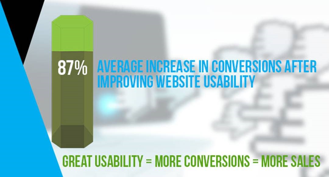
According to Nielsen, the average increase in conversions after improving usability is 87%.
Simply stated, usability optimisation is the practice of identifying any problems customers encounter while accessing and using your website and removing those barriers. Neil Patel also said that usability just means making sure things work well so that the average user can use the site without encountering difficulties.
When conducting usability testing, you get a direct input on how your visitors are using your website. Sometimes, you may think that you have designed the best website there is in the world, but you end up realising that people aren’t interacting with it optimally. Although this can be a humbling experience, designing the website to suit your audience is the wisest thing to do.
Users Think Differently
The thing is, you are not the user - your customers are; and they are most likely to view your website differently. People see the world through their own prism and it might not be possible to know what really works for others. For instance, you can spend a lot of time on your site, but that is not what your users are going to do. You might be fascinated with some of the tools and applications you have included on your site, but your users might find them a little distractive. You might install a plugin that you think will make your website look beautiful and sophisticated but it may end up slowing down your website and annoying your users.
As you can see, usability is all about the end user. Usability testing gives you insights into what the user wants so the result or feedback you get is very valuable.
In a nutshell, it is all about the experience of the user and whether or not your site is easy to use from the customer’s point of view. Usability testing, therefore, never ends because there is no such thing as a perfect website.
The Goal Of Usability Testing Is To Make The Visitor’s Life Easy
The goal of a well-designed website should be to prevent nobody from purchasing anything and allow anyone who wants to buy to do so in a seamless manner. So what could go wrong? Here are aspects of usability testing you should look at to increase your website accessibility.
Accessibility
An inaccessible site is as good as a dead website. Unfortunately, there are some websites that are so difficult to access. Have you encountered websites that require you to input a lot of information before you can be allowed to access them? Sometimes, you end up wondering whether you are trying to access a classified intelligent government website. An inaccessible website could be losing a lot of potential sales or even make it difficult for search engines to index it.
Clear Website Structure
It is critical to ensure that your website has a clear navigation. While the website developer has a clear understanding of the logic behind the structure of the website, this is not always the case with other users. The website navigation should, therefore, be clear for your users. One way to do that is to include a minimum number of tabs. Too many tabs can be confusing to the visitors. Reduce the number of steps your site visitors have to go through to make a purchase. Also, take note that modern web design can harm conversions because there is always the temptation to create a fancy website at the expense of functionality.
Is The Website Mobile-friendly?
Most users (52.7%) access the internet via their mobile devices. So if your site is not responsive or mobile-friendly, those who access it via their mobile devices will not like the experience and will leave your site and proceed to your competitors’ websites.

Easy To Fill Forms
Web forms such as SaaS, ecommerce and booking forms are important components of any website. They are normally the final step when making conversions; therefore, they need to be as clear as possible as you don’t want to lose the customer in this last stage. Test your forms to see whether they are easy to fill out. If there are any barriers, you need to remove them. The rule of the thumb is not to ask for too much information. Only ask for information that is absolutely necessary.
Fast Page Load
Today’s website users are extremely impatient so one of the major goals of internet marketers should be to improve page load speed to ease access. People want to get specific information as quick as possible without encountering any interruptions or having to wait for the page to load.
If your page load speed is slow, you will lose a lot of potential customers to the competitors. The recommended page load speed shouldn’t exceed 10 seconds. As a matter of fact, page load speed is one of Google’s ranking factors.
In short, a page that loads fast leads to great user experience which leads to higher conversions. Slow page load speed leads to bad user experience which would then lead to increased bounce rate.
Clear Call-to-action
Once you have managed to get a potential customer to visit your site, many marketers find it difficult to convert prospects into paying or loyal customers because of the lack of clear CTAs. Design your website in such a way that the visitors are guided towards making a buying decision or signing up. Most websites make the mistake of giving too much information to their site visitors or creating too much distractions and the users end up leaving the site without making a purchase, downloading or signing up.
Use clear Call to Action messages that tell the customers what to do. Such messages should be conspicuous, uncluttered and large.
Final Words
When we ticked all the usability testing factors above, we realised improved conversion rates. As it turned out, usability testing and improvement isn’t difficult so long as you are willing to listen to the users by looking at the data. Usability testing is not a one-day-event. It is a process that never ends. Improving the usability of your website yields results, so ensure you aren’t left behind.

