This is the million dollar question isn't it? Every form needs to collect enough information to qualify a lead or close a sale... but too many fields will result in abandonment. So what's the answer? This is going to be annoying but... it depends. Don't leave just yet... we've got some great insight on form design.
The correct answer, of course, is enough. Enough fields to capture the necessary information you need to capture and qualify your lead. While your marketing or sales team may want dozens of fields of information, I'd highly recommend you default to as few as possible, here's why:
Formstack has done a ton of research with their millions of users on form field optimization and have found:
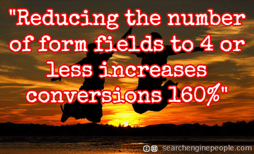
- [tweetable]Reducing the number of form fields to 10 or under increases conversions by 120%[/tweetable]
In fact, simply reducing the number of form fields from 4 to 3 increases conversion rates by 50%! There's no doubt that reducing the number of form fields increases conversion rates.
How About Zero Form Fields?
According to Dialogtech:
[tweetable]52% of those that couldn't speak to a real person say it has impacted their decision to buy[/tweetable]
That's right... if people couldn't call a phone number published on a web site and get a response, they abandoned. That means that half the people arriving at your landing page may abandon you right now because you don't have a phone number that they can just pick up and call or that you're not answering.
Add a phone number and pick up those. Be sure to answer - putting people on hold for too long will make them abandon as well. According to Callcenterhelper.com, [tweetable]60% of customers have left a company because it lacked good telephone customer service[/tweetable]. Win and keep customers by offering phone numbers on your landing page as an alternative to just filling in a form.
Since mobile optimization is growing, you can even provide a click to call button on your landing page by hyperlinking utilizing the tel element in your anchor text.
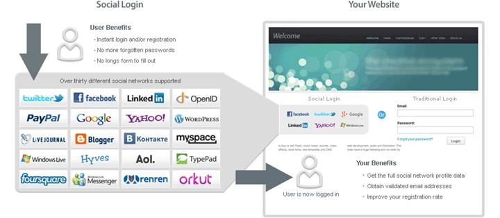
How About Social Login?
Another means to reduce form fields is to simply offer an OpenId login where people utilize Google, Facebook, Twitter or some other service to prepopulate the information that you need. Check out services like loginradius or oneall that offer integrated social logins for landing pages. Here's Oneall:

Many landing page solutions provide this as well.
How About Prepopulating Fields?
If you're utilizing a marketing automation solution, you'll often find that when you revisit a site, you're already known to that site. You may not even see a form - just a notice to welcome you back and a submission button. It doesn't require a 6-digit solution to do this, though. You can have your developer set cookies with your form and then recall the results if someone lands on another landing page or form on your site.
How About Faking Fields?
Sometimes it's simply the impression of many form fields that immediately drives a prospect away from your landing page. There are user interface techniques that you can utilize to make your form appear smaller:
- Put form fields side by side like first and last name to reduce the number of rows and overall footprint of your form
- Utilize conditional logic to only display form fields that are necessary to reduce the number of rows and overall footprint of your form
- Utilize pagination on your form and provide feedback on how many pages are left. A long form split up into multiple short pages will convert higher than a long form
How About Hidden Fields?
I'm always surprised by the number of clients we have that deploy forms on landing pages that don't capture additional data that's readily available. The browser, mobile or desktop, referring URL, landing page URL, operating system, time of day, day of week, geolocation, IP address, search keywords (for those not logged in), and even screen resolution can all be captured on a form and provide great insight.
For example, you could find that desktop is converting more than mobile, so perhaps you need to work on your form's responsiveness and make the fields and buttons easier to tap and enter information in.
IP address is fantastic - especially in B2B. Even if someone doesn't even convert on a landing page, you can capture their IP address and identify the business that's visiting that page! We utilize Lead Forensics' amazing service for this.
How About Post Conversion Fields?
Do your visitors really have to provide all of their information up front? Why not ask for their name and email address and then respond with an appointment request that asks for other pre-qualification fields like budget, timeline, company name, etc.? This way they know they've got your attention and they can fill out the additional information to schedule the demo or make the sales appointment.
Some great post conversion questions are:
- What is your budget for this engagement?
- When would you like to begin?
- Could you provide an overview of the project?
Time, budget and needs will let you rank your prospects so you can pursue the best leads first.
Our Solution
We default most of our clients' forms to 3 simple fields - First Name, Last Name and Email Address. We can do company lookups utilizing the domain of the email address and get more insight into their company and whether or not they're a viable prospect. Or we may utilize any of the strategies above to capture other pertinent data necessary to qualify them.
Now Read
- 5 Conversion Rate Optimization Case Studies
- Optimizing your Landing Page Form Fields for Conversion
- 7 Tips to Improve Conversions at Your Membership Site
* Leader images made with photo by juhansonin, Aaron Jacobs, Stephen Korecky, johnwiechecki


Great post Douglas
I think when considering how many questions to ask on your landing page it’s particularly important to analyse which user devices your landing page is designed to attract. If it’s for mobile, tablet and desktop I’d suggest keeping it as simple as possible. Ideally I’d advise creating a landing page specific for each separate device. If this isn’t possible I would advice looking at the potential traffic and think about how users will be accessing your landing page. I’d definitely say that you really should focus on a mobile friendly form so that the user doesn’t feel daunted when completing your enquiry form.
I think social login is certainly a useful tool to implement on some landing pages, however I think it needs to be used with an element of caution. For example people who are filling out an enquiry form for a solicitors may want their details to be kept private. Even if the social login promises to do so it’s unlikely a user will comfortable choosing this option particularly when sensitive data is involved.
Great insights. We chose to implement 6 fields whose 4 are compulsory. The openID thing is actually something we will consider in the future.
Thanks
Alex – great insight and I always advise testing over believing anything on the web 🙂
Twenga – Thanks and best of luck!