Summary: for the most part the concept of a mobile site is outdated; aim for mobile delivery instead.
What's A Mobile Site All About?
Not long ago browsers on mobile telephones were as clunky as the very first mobile phones themselves.
Many mobile-specific recommendations you read on the web date back to this era.
Between the limited capabilities of those older phones (text only, to name one) and the very limited screen estate (3 to 6 lines of 12-20 characters per line!!!), mobile browsers felt like a proof of concept ("look, it works!!") more than anything else.
Because of the severe limitations there was no way in hell you could just send your web site to a phone like that. You had to make a 98% stripped down version of your site. Think of it as summarizing a page on your site, including essential navigation options, to a 140 character tweet -- that's how bad it was.
Companies that could afford it did their own "clunky mobile browser" sites. The golden days of WAP development!
For those who couldn't or wouldn't pay special services sprang up; mobilizers. These services would essentially take your site, rip most everything out and deliver the mangled, stripped down version to a phone.
Opera built such a service into their browser giving Opera Mobile a very speed feel. Google still runs one.
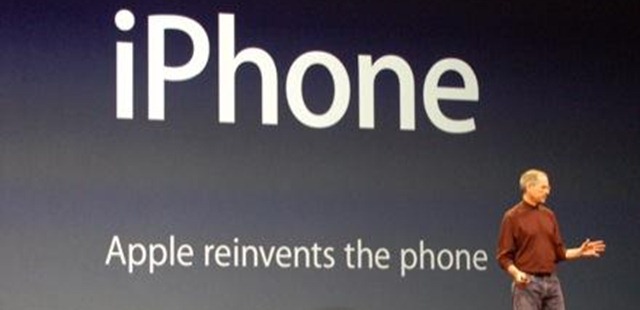
"And we are calling it iPhone!"
January 9, 2007, isn't a turning point in the history of the mobile web -- it's where the mobile web really began.
When Steve Jobs introduced the iPhone.
The iPhone, Steve explained, didn't come with a so-called WAP-browser (what mobile-specific browser were called); it would come with a real browser, Safari.
"Now I want to show you something incredible, I want to show you Safari running on a mobile device. I'm going to load in the NYT, rather than just give you the WAP version, we're showing you the WHOLE NYT web site. I can put this into landscape mode and there it is, I can scroll up and down here..."
-- Steve Jobs
It was amazing, it was unbelievable; it looked precisely how you imagined mobile to be -- like the real web, but smaller.
The iPhone made mobile specific crapped down minimalist versions of a website not needed, redundant, outdated.
One Website, Multiple Platforms
Since then we're moving to a web where you have your one web site and deliver it in such a way that every sane device can show it to its best potential.
Using browser-sniffing and/or so-called media-specific style sheets make it so your web site can look great on an iPhone, an iPad and a desktop PC.
One Site, One URL
With the difference between mobile and "real" site disappearing, the need for a mobile-specific URL is disappearing as well.
Search engines, web surfers, web site owners and -- yes -- sheer sanity cannot continue to let the web fragment into isolated pockets of trimmed down-ness.
Besides the fact that it would make no sense to continue to do so a serious problem is too that the mobile web lacks the history and pattern of the traditional "real" web. That means that many essential ranking factors don't work for the old "mobile" web. A link to m.example.com/great-post.html does not benefit www.example.com/great-post.html -- and that makes no sense.
The future proof solution is to use one URL for all versions of your web site and deliver as to the capabilities of whatever is requesting your page; and to leave the judgement of those capabilities to the device doing the requesting. It will do or not do certain things based on device specific stylesheets; you don't need to decide that for it.
Of course common sense good practices remain applicable. Huge image file size was already not a good idea for the traditional web; for mobile it's neither. Keep it slim and speedy. Deliver what you have to, no more.
What Do Google & Bing Say?
Remember that this is an emerging situation but this is where things stand at the time of writing.
Bing (formally):
"At Bing, we want to keep things simple by proposing the one URL per content item strategy. For each website, instead of having different URLs per platform (one URL for desktop, another for mobile devices, etc.), our feedback is that producing fewer variations of URLs will benefit you by avoiding sub-optimal and underperforming results. It can help manage unwanted bandwidth usage as well."
-- Building Websites Optimized for All Platforms (desktop, mobile, etc.)
Google (informal):
"An easier solution, if you can do it, is to just serve smartphone and desktop users from the same URLs, using something like special stylesheets or CSS3 media-queries to optimize the content shown on smartphones. The advantage of that is that you don't need special URLs, think about the crawling and indexing of them, nor would you need to consider how you'd redirect smartphone users."
-- John Mueller, Google Webmaster Trends Analyst
Conclusion
- Much of what you read about mobile SEO and mobile recommendation is outdated
- The gap between mobile and regular internet is fast disappearing
- ...and so automatically does the need for mobile-only versions
- Instead of spreading your link love and efforts over multiple URL's, use one and the same URL to deliver to all devices
- which does mean you target the desktop, tablets, and smart phones
- but you don't target WAP browsers
- Should you try to target those? What's the ROI vs the effort, seriously?
Macworld images: Engadget


