
Website design testing is an essential step in your marketing strategy as it allows you to find the most efficient combination of elements. This will have a direct impact on the success of your entire marketing strategy. A great design equals great user experience, which, in turn, leads to more conversions.
You also have to make sure that your website design aligns with your general marketing strategy. This means that all elements across all platforms must follow the same theme and have the same message. For example, say you are undertaking bulk WhatsApp marketing tactics then the fonts, color scheme, and image styles used on each of your communications, must be the same for social media accounts’ covers, user pics, etc.
Call To Action Buttons
Many consider Call to Action (CTA) buttons the most important element of a website as they are conversion buttons. Effective CTAs must:
- Have a contrasting color to be visible.
The color must stand out among all other elements of the page. - Have a short, motivating, and action-packed text.
You don’t have to get creative with messages, but it’s imperative to be clear. Often the best CTAs are simple ‘Get Started’ or ‘Sign Up for Free’. Note that text must be legible. - Look and ‘feel’ clickable.
‘Raised’ buttons with shading around them stand out more prominently.
Examples:
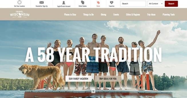 |
That’s how you DON’T do CTAs. First of all, there are two of them, which is confusing by default. Also, neither carries a clear call to action. Finally, the colors fit the website design scheme, but this is what makes the buttons less prominent.
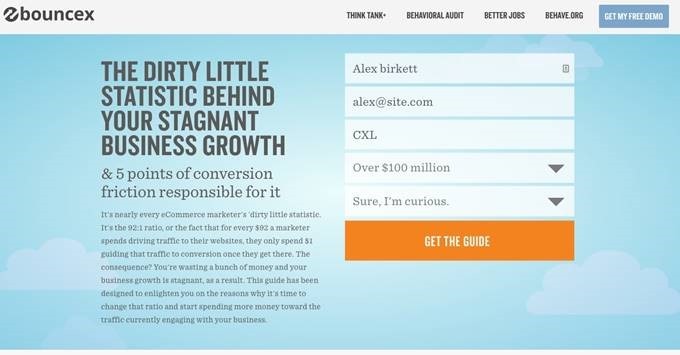 |
BounceX has some of the best CTAs on the Web. The button is visible. The message is not only inviting, but also ties in with the surrounding text, which leads to the CTA and motivates the website’s visitor to click.
When you do website design testing for CTAs, the most important variables to focus on are:
- Size
- Color
- Shape
- Text
- Position
- Special effects
Tools: The HubSpot marketing software includes a good CTA a/b testing tool.
Color Scheme
Colors have a huge impact on marketing, as is proven by studies. In fact, poor color combinations are one of the reasons why customers leave websites immediately. Therefore, any website design testing must compare impacts of different color schemes. The best colors for a site must be:
- Complementary in the overall scheme to create a uniform background.
- Contrasting in text and other elements that must stand out to draw attention.
- Neutral (black, white, gray) for text to ensure easy readability.
Examples:
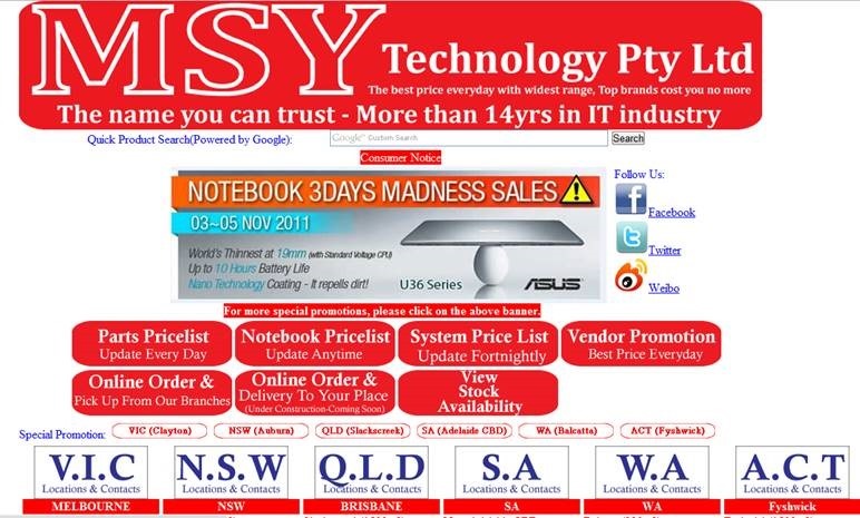 |
Despite contrast, this color scheme has too much white, and the red seems overwhelming. With only three colors in the scheme, the website has too much contrast.
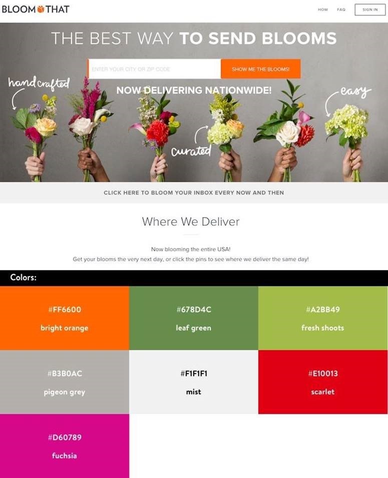 |
A fantastic combination of an unobtrusive gray background with a vividly contrasting CTA and beautiful images to liven up the page.
Tools: Use tools like AB Tasty, Google Experiments, and Adobe Target for website design testing with different color schemes.
Headlines
The headline is one of the most prominent elements of website design and one that directly characterizes the company. Therefore, visitors usually assess your entire business based on it.
A perfect (or near-perfect) headline must:
- Be short, simple, and to the point.
Note that too short headlines are just as bad. Aim for about 70 characters, but be flexible depending on the message you need to send. - Explain the purpose of the website/business.
An average visitor will leave a website if they don’t understand its purpose in under 7 seconds. Therefore, the headline must incorporate all the most relevant info about your products or services. - Invite personal connection with the readers.
Starting your website headline with a ‘Hello’ or ‘Welcome’ makes the message more personal and friendly.
Examples:
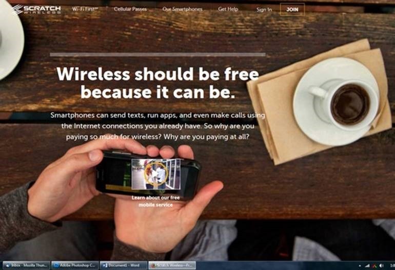 |
This headline is quite good as it’s attention-grabbing and hints on the service offered. However, the message isn’t quite clear, and one can’t understand it without the sub-headline.
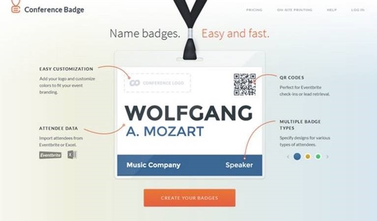 |
Clear, simple, creative, and makes name badges sound interesting. A stellar example of a headline.
Tools: Optimizely offers a headline A/B testing tool in their website design testing solution.
Layout
The layout is one of the main factors that determine the quality of user experience. The ‘rule of thumb’ to use for choosing layout is to ensure that any visitor can find whatever they need in 3 steps or less. Best layouts are:
- Clear and simple
- Intuitive and easy to navigate
Examples:
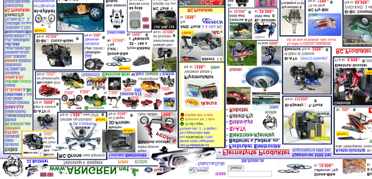 |
The worst website layout ever as the page is too cluttered.
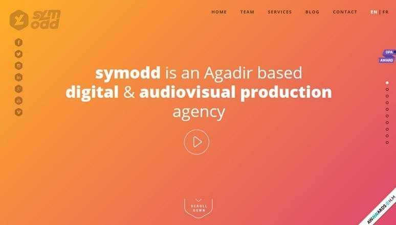 |
A great layout with each navigation element visible, so visitors can get what they need fast.
Tools: Use Optimizely, Hubspot, or Unbounce to perform website design testing for different layouts.
Final Tips For Great Website Design
The design of your website is the literal representation of your business online, and your customers will judge your company by it. Therefore, it’s essential to make your web pages attractive and original.
Each page must carry a clear message and the website as a whole must be easy to navigate. Most importantly, as people use different gadgets and browsers to assess the Web, your site must be highly responsive. So, be sure to perform your website design testing accounting for all possible variables.
Hand-Picked Related Articles:
- 13 WordPress Conversion Testing Plugins
- The Best A/B Testing Tools For Mobile Apps
- Elements You Must Test On Your Landing Page
* Adapted lead image: ![]() Public Domain, pixabay.com via getstencil.com
Public Domain, pixabay.com via getstencil.com
