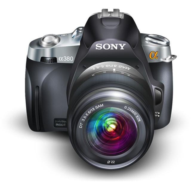
Remember window shopping? Pressing your nose up to the glass to get a good look, a really good look, at that train?
Or more recent, walking into that store and not just looking at but playing with those laptops? Feeling how swiping icons on an iPad feels?
That closeness and that tactility is what sells products.
Consumers who touch products are more likely to buy those products. Better yet; they are willing to pay more for them.
HOW TO ENABLE WINDOWS SHOPPING ON YOUR SITE
Evidently you can't have customers touch e-goods or you would have to resort to sending them samples. But you can get them as close to the product as possible. Make it as real and tactile as possible.
The way to do that is by using BIG HUGE PRODUCT IMAGES.
Big huge product images have several advantages.
- Consumers want to see big images (when they request them by clicking through...).
- People value a product more when it's physically in front of them [PDF]. And making the product almost life size (or better) is as close to physically in front of them as you can get on the web.
- Web visitors watch big product images very closely, almost inspecting them, unlike stock photos of people or generic product images which are largely ignored.
WHAT THIS MEANS TO YOU
- Try reducing the number of product images on a category page but make product thumbnails larger. Experiment with 300x300 and larger. Keep an eye on web site speed though!
- Use larger product images on your product page. Make clear that there is a clearer, larger view available.
- Make a 3rd view page (category -> product -> close-up) with as life-size an image as possible. Maybe more than one? Use the page to add additional descriptive text about the product. It will act as additional (searchable! findable!) content *and* it is speaking to people who seem to be getting really interested in buying this thing!
As always: Think it. Test it. Track it.
How do you get people to engage with what you sell?


