This post was co-authored with web design specialist Alexis Elliot.
Google outlines in its quality guidelines for building smartphone-optimized websites 3 configurations which they recommend.
1. Sites that use responsive web design, i.e. sites that serve all devices on the same set of URLs, with each URL serving the same HTML to all devices and using just CSS to change how the page is rendered on the device. This is Google's recommended configuration.
2. Sites that dynamically serve all devices on the same set of URLs, but each URL serves different HTML (and CSS) depending on whether the user agent is a desktop or a mobile device.
3. Sites that have separate mobile and desktop URLs.
We have all jumped on the responsive design bandwagon and have also been creating separate URL mobile sites for years. Its the second option, dynamic serving or Adaptive Design which is just starting to be talked about in Web Design & Development circles.
Users dont care how you give them the information as long as its accessible on a computer, their phone or any device capable of viewing it on.
Adaptive Vs. Responsive Whats The Difference?
Adaptive web design - Coined and explained by Aaron Gustafson, Adaptive Web Design Crafting Rich Experiences with Progressive Enhancement is a simple set of design methods that concentrate on the user experience of a site on devices rather than the browser itself. Its all about layering your design through defined layout sizes, CSS and JavaScript allowing the user to have the best experience with the technology they are equipped with. This is called Progressive enhancement.
It allows the user to have as much capability as the device will allow them to use. Its about form and functionality all in one.
As similar as they may seem they actually are quite different from a user experience point of view and the way they serve up content to different devices.
Both have defined layouts for different resolutions. With responsive, it doesnt matter what device you are on, the queue point to display the different optimized layout of the same HTML is dependent on screen width. With adaptive the server sends a message to Googlebot-Mobile (or any other search engine bot) using the Vary HTTP header. This message will tell the bots which separate optimized variation of the sites HTML to display depending on different factors such as the device or OS. So when using a Windows OS, you will be scrolling left to right through the headlines or up and down; using a MAC OS.
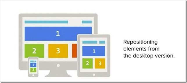
Responsive is relying on fluid and flexible grids giving the user a single experience across multiple devices. This is great for simplistic sites but what happens when all your conversion points have reconfigured to the bottom of the page
Adaptive Example:
Picture Source: https://polarmobile.com
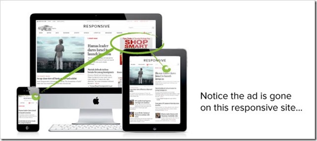
Responsive Example:
Picture source: https://www.drumbeatmarketing.net
What happens to my online media buy?
Adaptive design allows you to monetize mobile ads and offer up Geo-specific information. This is a plus for marketers and their targeted media buys.
Performance Benefits
The biggest downside to Responsive design is the performance implications that come with serving the same content scaled for mobile devices. When dealing with images, designers and developers are struggling to implement a concrete solutions how to handle image optimization for experiences on a large desktop screen vs. a small mobile device. Serving the same hi res image scaled down in size as the device gets smaller is not optimal and requesting a new image for each layout causes too many HTTP request.
With adaptive, designers and developers have complete control over what content will be served up when. Think of it as serving completely different websites depending on which device the user is on. This means that all the content, functionality and layout can be customized and optimized for that particular device.
Im Developing A Mobile Site, Which Implementation Do I Choose?
With all the facts on the table about the pros and cons between responsive vs. adaptive as well as good old separate URL websites the decision on which implementation to choose still might not be clear. The answer of course is it depends! Googles preferred method is responsive design; this is because they have no extra URLs the need to crawl. Google just looks for the rel canonical and rel alternate markup and they are happy. But what if my users require a completely different experience on mobile than on a desktop? If my company is an insurance claims organization my mobile site could be specifically developed so users can submit a claim quickly and easily right from the road if they get in a car accident. This goal would easily be achieved using a separate URL implementation. Adaptive design would be beneficial for mobile sites targeting different regions as the content, color scheme etc. can be swapped out.
What it comes down to is that all 3 implementations are correct when done properly. It is up to the goals of your business which approach is right for you.
This post was co-authored with web design specialist Alexis Elliot.


