When you set about creating your site you probably had a clear vision. You had it all set out on paper. You'd thought of everything.
Your service pages were designed with conversion in mind and you had added some great calls to action.
Your home page was striking - a picture of aesthetic beauty.
You had remembered that your navigation would need to easy to use, you had picked the right fonts and colours, you had employed a professional designer and had your brand identity covered.
But it happens. There are pages on most sites that are neglected and unloved. Its a shame because some of these pages are important in the conversion process. These pages are what set you apart from your competition when all other things are equal.
Here are some of the most commonly neglected pages of all time - in no particular order - with the reasons why these pages should be higher up on your list and some solid examples of these pages in the wild...
About Us Pages and Meet The Team Pages
The about us page. The place you can really sell yourself and your team, the page that lets blow your own trumpet withpout coming across as arrogant.
Log into Google Analytics and have a look at how many people do actually look at your about page - its more than you think. Then look at the engagement that page has. Probably not that great.
Across the Internet the about us page is treated as an afterthought, something that businesses appear to get to get an intern called Malcolm to write up for them minutes before a new site goes live. It's time to take step back and consider that people DO read these pages, they ARE interested in what you do, what you stand for and how good you are at what you do.
In a nutshell:
- About Us pages instil trust
- About Us pages help you differentiate yourself from the competition
- About us pages can help potential new employees understand more about your business
- About Us pages humanise your business and brand
- Meet the team pages let clients and prospective clients see who they are working with
- Meet the team pages let you shine a lite of team skills and achievements
Further reading:
How to Create a Great About Page
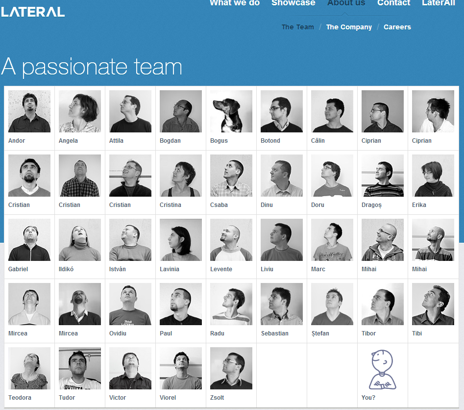
Creating Creative Meet The Team Pages (With 13 Awesome Examples)
The About Us Page in a Social World
How to Write About Us Pages " Step by Step
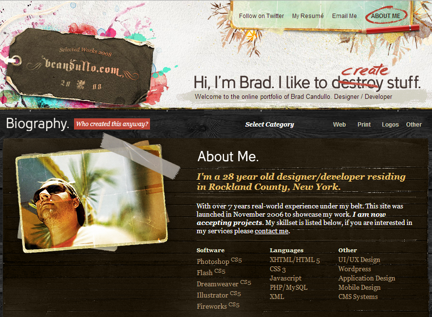
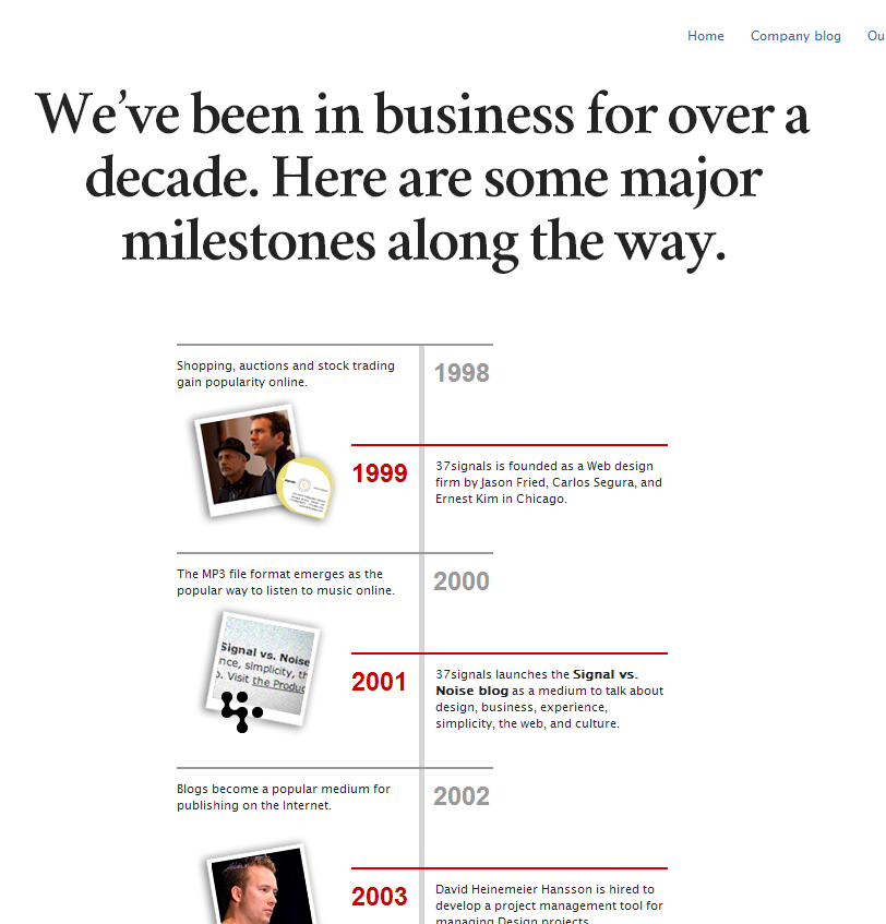
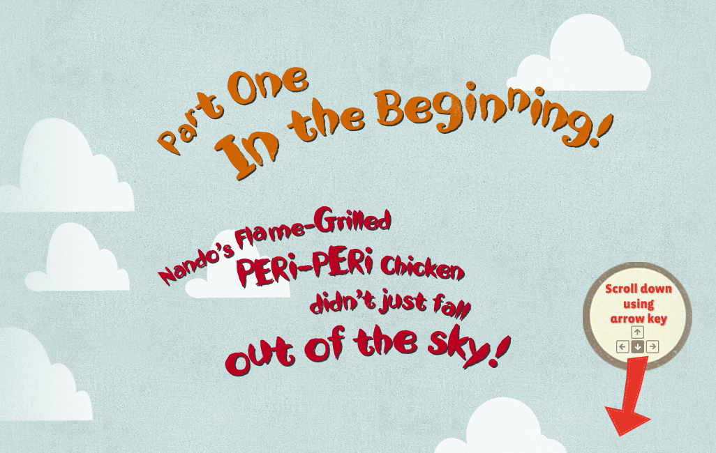
Creative examples (some of these are interactive so I encourage you to visit the pages):
https://www.lateral-inc.com/about-us/team/
https://www.bcandullo.com/bio.php
https://www.nandos.co.uk/story/index.html
Testimonial Pages
The humble testimonial page. The page that stagnates over time and has plaudits that stretch right back to the 1970's. When you are getting started out you probably cant justify a testimonial page - and nor should you. But over time you can collect some pretty impressive and compelling words to help convince people that they should work with you.
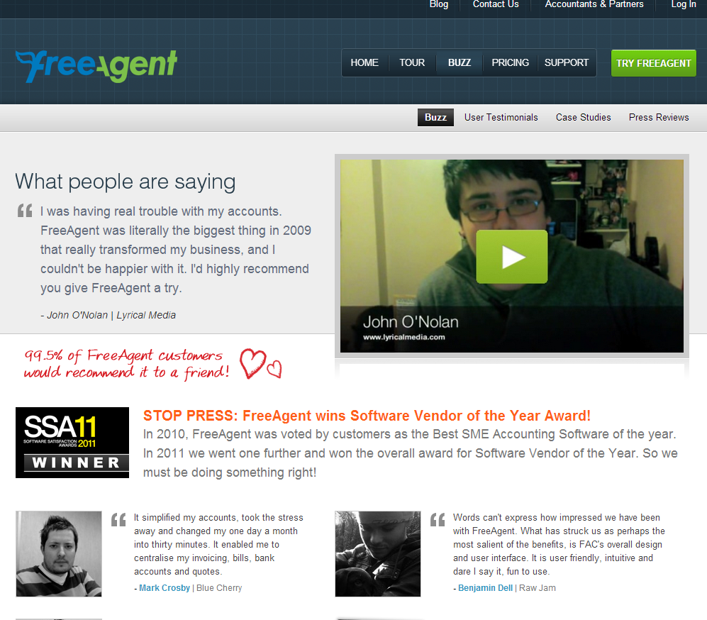
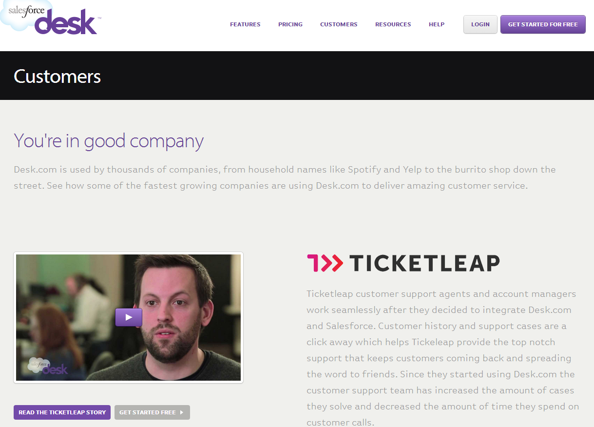
The issue with a lot of testimonial pages on the web is that they are stagnant, static and uncreative. If you just present them in a list form I can pretty much guarantee you that nobody is going to read them. Give them a bit of life and you are heading down a different path. If you put some thought into how you present them and how they fit into your site you can easily match the right testimonial with the right services and products - pulling them from the testimonials page to back up your sales copy.
Don't send Malcolm out to gather up the testimonials, prepare in advance. Have the person who has the most contact with the client put together a testimonial with them. Get permission to share some statistics.
- Testimonial pages provide social proof
- It matters more what other say about you than what you say about yourself
- Testimonials can and will help conversions when used correctly
Further reading:
How WikiJob increased sales by 34% by A/B testing customer testimonials
Use Video Testimonials to Increase Conversions
How to use social proof to increase conversions
Creative examples:
https://www.freeagent.com/buzz/
https://www.desk.com/customers
Contact Us Pages
Why oh why is the contact page such an afterthought? Why do many sites just slap on a contact form and think that will cut the mustard?
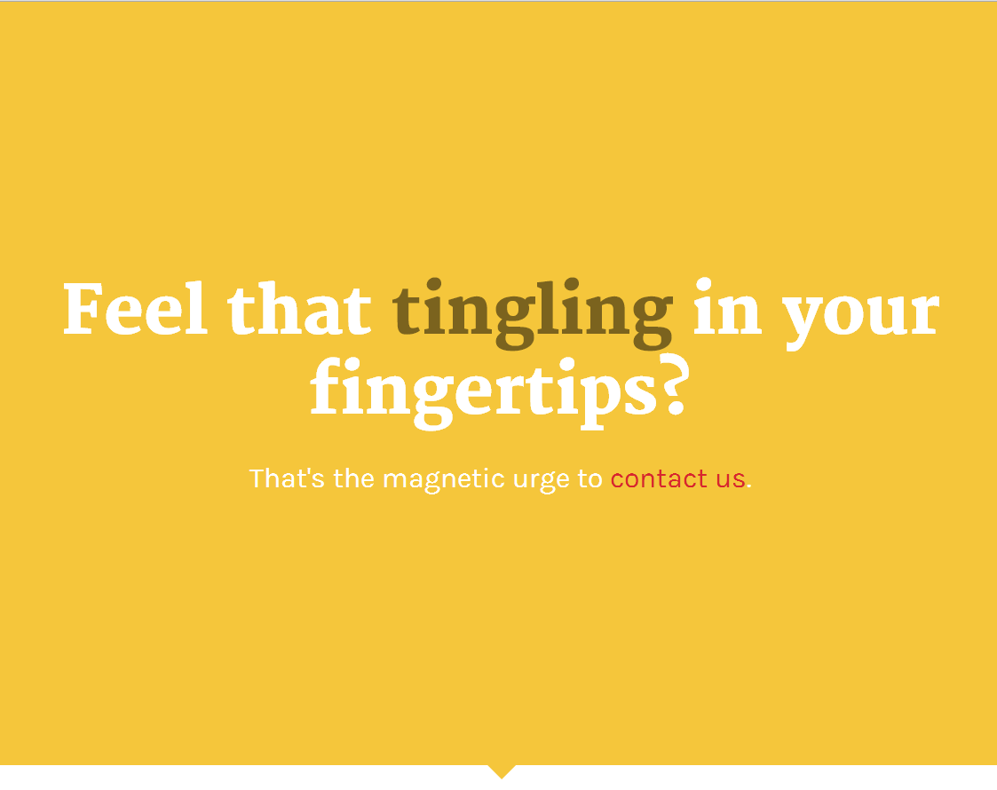
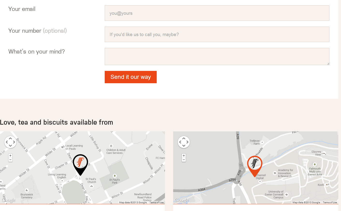
Your contact form is an important part of the website. Because you want business,right? Get creative, entice people to send you their details. Don't assume that people want to get contact in via a form or via email. Give them as many ways to contact you as possible. Give your contact pages some character. Breathe some life into a usually lifeless page on sites - stand out from the crowd, its not as hard as you think.
Improving the quality and thought that goes into your contact page can increase conversion quite significantly and dont be afraid to split test different versions.
In a nutshell:
- A great contact us page can increase conversion
- A great contact page can inspire action
- A creative contact page can aid in content recall
Further reading:
Contact Us Page Best Practices with 22 Fabulous Showcases
15 Examples of Well Designed Contact Pages
10 of the Best Contact Us Pages on the Internet
Creative examples (again you will need to visit these to get the full picture):

