Copernic, makers of beloved reputation management monitoring tools like Copernic Agent and Copernic Tracker but also of one of the best desktop search tools, today announced they've launched a new and improved home page.
Here's what they left on the table.
Canonical URL
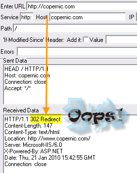
Copernic.com redirects to www.copernic.com " which is a good idea. A bad idea is to make the type of redirect a 302. That's a redirect of the temporary kind, akin to a detour when construction is going on somewhere.
"Look, for the time being we moved this over there but eventually some day it'll come back here". That's what that redirect says and that's not what you want to say.
What you want to say is "see that? forget about that. That's over, that's history " come over here to play".
Why?
Because you want everything that search engines know about your site and count toward your site's ranking to accumulate at one point and not be spread out over two domains (which copernic.com and www.copernic.com essentially are).
"But Google has a setting and a tag that handle this kind of thing and they say they're pretty good at figuring this kind of thing out."
Ah. You mean the very people who changed the stated technical behavior of their self-invented rel=nofollow tag now also have a self-invented canonical tag? which is supposed to work in a certain way, cross my heart, hope to die? Interesting.
Meta Keywords
To be honest, I'm not a big proponent of meta keywords. Virtually useless for search engines but the smaller meta ones they can demand more time than they're worth. And although a thorough look at a page usually tells an SEO what terms the page is targeting, a quick look at this list of keywords is like reading the internal memo "terms we want to rank for".
Used by search engines for retrieval but not for ranking, what I do find a brilliant is Danny Sullivan's idea to use meta keywords to target misspellings. You can easily see how this would apply to alternative spellings of a product or service as well.
Copernic includes the keywords, which is a "oh well, why not" kind of thing, but excludes misspellings " which is a "why not?" kind of thing
Inline Cruft
CSS, like clothes, dresses up, styles, fashions and is easy to change. Unless you spraypaint your clothes on or put your CSS inline with your HTML.
That very code precision could be referred to as what psychologist call "anal retentive" " or forward looking.
Search Engine People " to toot our own horn here a moment -- was telling people in 2004 2005 to clean up their sites, externalize their resources. Companies that ran with our recommendations coded light-weight, cross-browser compliant pages and consequently had not only no problem at all to make the switch to mobile " it didn't cost them a thing either.
Those same sites aren't in the "worried!" camp either now that Google emphasizes speed.
There's a reason why it's called "best practices" and it's not precision for the sake of perfection: it's forward looking common sense.
So keep those pages light-weight, rip out what you don't need there. And yes, that includes removing inline JavaScript:
Build a page from the ground up. First simple, plain vanilla HTML. Then CSS. Then unobtrusive JavaScript.
We have a Canadian construction TV show, the host of which has a solid saying; make it right the first time. That's what you should do to a web site.
Unclear how in the world this ties back to SEO? Read the above again: cross-device display out of the box (which equals first out of gate), speed-compliant from the start (which Google loves so much they give you tools to measure it) Smaller code footprint per page = more pages spidered per time allotted to that site.
What will change in 2010 that favors doing stuff right vs just doing stuff?
Make it right " the first time.
Words
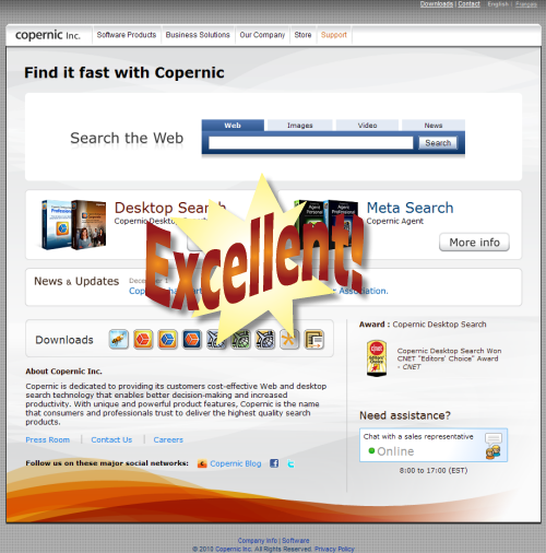
This is your home page on "I'm a human looking right at ya!"-mode:
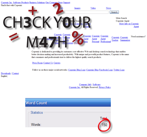
and this is your home page on "I'm a machine " I don't do pretty"-mode:
150 words? What's up with that? Did the money run out?
Although the links contain the product names, the real on-page text blurb reads: "Copernic is dedicated to providing its customers cost-effective Web and desktop search technology that enables better decision-making and increased productivity. With unique and powerful product features, Copernic is the name that consumers and professionals trust to deliver the highest quality search products."
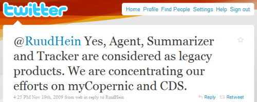
Compare that with Copernic's product priorities:
myCopernic is the cool way in which you can access all search data Copernic Desktop Search (CDS) would have access to " from anywhere, anytime.
Neat product but needs defining to be sold: people tend to search for solutions, not products.
Those things should be s-p-e-l-l-e-d out on the home page.
Links
It's nice how the menu renders as HTML-only too. Good job. But with a home page being the prime estate it is and internal links from it meaning so much " we don't want to dilute their value by just slapping them on everywhere.
I mean, 3 (three!) links to "company", two of which are in the footer? 2 links to "products", one of which points to the directory, the other to the index page in that directory?
Use the force wisely
Conclusion
On the whole it's not a bad page. Besides which Copernic has a lot of link love to spend so they can get away with not optimally utilizing their prime estate. As long as they're building links the page will continue to rank but imagine how things would look if Copernic were to rank with the page instead of despite the page?
What do you think?


