Mobile users have unique needs and understanding their behavior is important for SEO as well as PPC conversions. But PPC experts especially need to make it easy for people to convert on a mobile device after clicking on an ad since there is a cost for every click. A website with a good mobile experience will have more conversions and for that to happen, websites have to be easy to use and accessible for the modern user.
We’ve discussed some common ecommerce problems on all devices such as abandoned shopping carts, too many form fields, requiring accounts to checkout, and not including trust signals. There are additional areas of concern for conversions that are specific to mobile devices.
To increase your conversion rate on mobile devices, it helps to understand core UX principles even if you are not a designer and this is equally important for lead generation sites and ecommerce businesses.
Mobile users are comparing brands on their devices and looking for things such as address and cross streets for brick and mortar businesses. Once mobile users add to a cart on their device, they want to just as easily edit it. They also want options to sort by price or customer reviews after completing a search. And everyone wants to see options for quick check-outs available on sites like Amazon. These are areas to address once someone is on your site
However, a slow load time may keep people from even accessing your site. Users may bounce and not even make it to a slow site after clicking on an ad which is wasted money. You paid for a click on an ad but did not reap any benefits from it. All of these things need to be considered in the design of a site so mobile users do not become frustrated and leave the site. It has to be fast, with a great design and quality content.
Unfortunately a lot of barriers to conversion still exist on mobile, such as a small screen size or no trust signals regarding credit card security. These are the types of issues that keep that last action of converting from occurring.

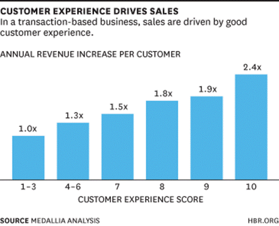
To show how important a good website experience is for mobile users, The Harvard Business Review examined sites with different conversion rates in The Value of Customer Experience, Quantified . What they discovered is that websites with a better mobile experience have 140% more revenue than web sites that do not offer a good experience!

What Makes A Good Experience On Mobile?
A recent Google Partners event focused specifically on Conversions and Form Entry as key factors for a good experience on mobile. Conversions are crucial for PPC experts and the checkout process has a significant influence on the likelihood of a conversion.
Once any barriers are addressed, web designers need to make it easy to convert across devices. Mobile is more research oriented and geared toward the upper funnel, and the final purchase may happen on a different device. Mobile devices are frequently used on the go and not when people are sitting down and ready to fill out a form. AdWords experts need to think about secondary conversions that can help with the cross device movement.
In addition to persistent shopping carts, other secondary conversions include allowing users to email cart information to themselves to save the research already conducted. This serves both as a reminder in the inbox for the consumer and an opportunity do some nurture campaigns with those email addresses. PPC experts can also use this email list for Gmail sponsored ads.
Another strategy is to provide a secondary CTA of calling the business. Mobile users who may not be ready to buy or only have a quick question before they commit to buying should not have to hunt for your phone number. Since they are on a smartphone anyway, the business phone number and business hours should be prominently displayed.
Remove distractions. Not only are too many reward choices a distraction at the time of checkout, anything that keeps someone from purchasing is considered an exit point. As someone gets closer to conversion, there should be fewer options to do something on the screen. When users are at that last part of conversion, there should not be a single thing on the site that does not directly contribute to making that conversion. Since the decision to buy was made, remove options to continue searching or to view another page on the site.
Forms for mobile users need to be very easy to use and should follow the below best practices.
- Use descriptive CTAs during the checkout process rather than familiar ones like submit, continue, or next. Make sure the action is consistent with whatever the next step is in the checkout process.
- Use the Google Places API to fill in address fields for your forms. The API uses stored Google maps locations and pulls up suggestions as the user starts typing. If the address is found, the address fields are then auto filled .
- Have billing and shipping addressed checked by default - especially for retailers in the business-to-consumer space. Requiring a consumer to fill both addresses results in a duplicate number of fields, making a form more cumbersome and requiring an extra step. Instead, provide the option to shoppers to uncheck the default of the same address. Only once that option is unchecked should the form expand for a second address.
- Utilise in-line validation so errors are shown immediately in the field rather than at the time of finishing a form. Submitting a form, then getting an error and trying to figure out where to make the change is frustrating, especially on a mobile device. Include a hint about what might be wrong in the field that resulted in an error.
- Dropdowns should be a last result. If there are three or fewer options, use buttons rather than a dropdown which requires clicking into the dropdown and clicking again on the desired option.
Testing
Even with all the suggestions and recommendations available to create a solid mobile experience, it does not remove the need for testing. Google Optimize, part of the analytics suite, is a newer solution for testing. “You can use your Analytics data to quickly identify areas of your site to improve upon, measure your site experiments against business objectives, and see exactly how changes to your site influence customer behavior and conversion.”
Looking For More On Mobile?
Google offers a Mobile Sites certification on the Google Partner portal. Although it is geared toward developers, it is very helpful for marketers to have an understanding of what makes good mobile design and to be able to talk about technologies with developers.

Another great resource from Google is a list of their 25 principles for mobile design. This product is the result of research from Google’s UX team on various websites and different industries and co-created by AnswerLab. It helps developers and marketers understand what users immediately look for on mobile devices

And finally, when you address what the users want and develop a website to do just that, good design will be a natural outcome when it comes to conversions and revenue.
Hand-Picked Related Articles:
- 5 Tools To Test If Your Website Is Really Mobile Friendly
- The Ultimate Guide To Mobile Site Speed Optimization
- How To Use Mobile Geo-location Successfully To Reach Your Target Audience
* Adapted lead image: ![]() Public Domain, pixabay.com via getstencil.com
Public Domain, pixabay.com via getstencil.com
