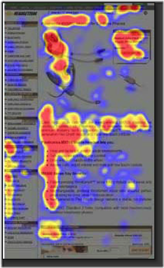
If you want to know what website visitors like, you can see it in their eyes... or at least where their eyes go. While eye-tracking studies have been around since the 19th century, increasingly sophisticated technology has made them more accurate, more insightful and more valuable to content marketers.
Our eyes focus on certain parts of the display screen, so that real estate has to be treated like the essential space it is. To optimize your content marketing strategy, take a few cues from new research and produce content so great that visitors can't take their eyes off it.
Swing Left
When it comes to optimum content, what appears on the left outperforms what appears on the right (sorry, conservatives). In a study from Nielsen Norman Group, subjects focused on the left side of the screen 69% of the time, versus only 30% on the right side.
The Takeaway: Everything important has to appear on the left, including your key points, infographics, navigation bar and call to action. Don't place it too far left, though; people tend to look at the middle-left more than the far margin.
"F" Everything
No, that's not a life philosophy - that's the pattern made most often in eye-tracking research. In numerous studies, browsers looked at the entire top part of the page, not just the left. Further down, they scanned through the first half of the page. Their eyes stayed close to the margin from then on, and that's how the scanners created the F.
The Takeaway: Place your most crucial information at the top of the page, either in the title or top paragraph, and less essential information in the second. Also, break up your content with subheaders. People may not read your lower paragraphs, but they'll at least get the gist.
Visuals Count
People like pictures - just look at how fast videos and infographics go viral. It's no surprise, then, that our eyes linger longer on content with visuals than text alone. In fact, researchers noticed Google searchers focusing more on results with video links than text alone.
While text still needs to be of quality information don't forget to add visuals to enhance the reader's experience. Clarity Way is a great example of doing visuals right. They keep their videos and infographics within their brand style and the visuals enhance the text and call-to-actions surrounding it.
The Takeaway: If possible, add video to content that appears in search engines. Otherwise, use visual cues to guide people to important text. If you have photos of people, for example, make sure their eyes are turned on the text you want people to read.
Pretty Things Shouldn't Distract
While eye-catching graphics can help draw attention to content, they can also take it away. Landing pages with a big burst or colorful may actually have lower click-through rates because the graphic steals focus away from the most important element: the call to action.
The Takeaway: Make sure graphic elements don't get in the way of core content. If necessary, add more flair to key elements so they don't get lost. For instance, put the first paragraph of your blog in a larger font, or wrap a text box around your call to action.
When Advertising, Go Native
It looks like banner ads are falling by the wayside in the online marketing world. A recent study showed that native ads, which appear throughout page content, got 53% more attention than display ads, had a higher lift in purchase intent and were nearly twice as likely to be shared.
The Takeaway: Mix native ads with links to bring more people to your content. A native ad about your latest white paper will generate more clicks than an ad on the sidebar. When writing a guest post for another site, place a native ad to a key landing page on your website.
While you always have to optimize the content visitors are looking at, you'll get even better results if you optimize where they look at it. Leverage the findings from eye-tracking research and see for yourself.


