Some think, that Google's "non provided" killed keyword research as we know it. Perhaps, it is true. But there is enough provided information to make keyword research meaningful.
I am going to show you how you can target your audience better by analyzing the keywords, for which your website is showing up. Let's get started with collecting data from Google Webmaster Tools.
Collect Data
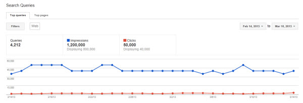
Go to Google Webmaster tools and find Search Queries under Traffic.
Select With Change to see the difference in the number of impressions and clicks. Download the table.
Prepare the Data
In Top Queries, format your data as a table. It will be easier to work with, especially because the next step involves some manual labor.
Add a column and call it Category. There are several ways you can categorize your data. I am going to describe two. Feel free to add as many category columns as you need.
One way you can categorize your keywords is by the searcher's intent. Where are they in the buying funnel when they type their query? Are they aware of your company? Are they still researching your product, or they are ready to buy? When you see for which types of queries your website is visible, you will be able to create better content.
Second way to categorize the keywords is by query theme. The common themes in queries are brand, location, more information, specials, and other, which encompasses everything else. I am going to use a local business site as an example.
Filter all branded terms. To do that, click on a button in cell A1 -> Text Filters -> Contains... and type in your brand keyword. Then, add brand category to all keywords in one big swoop. Filter out location queries that include a city/state name, or geographical area. Assign location category to those terms. Filter out queries searching for more information. Mark them as info category.
Add another column and name it overall index. Assign 3 points to each keyword that is in position 1-3. Assign 2 points to keywords in position 4-10. And 1 point to keywords that appear on the second page of SERPs. The rest of the keywords get a score of 0. Then, multiply it by the number of impressions. This way you will be able to see if impressions counted for something, or they were so far down the list of results, that nobody ever looked at them, let alone clicked.
Here is the formula:
=IF(Table1
[[#This Row],[Avg. position]]<4,3,(IF(Table1[[#This Row],[Avg. position]]>20,0,(IF(AND(Table1[[#This Row],[Avg. position]]>10,Table1[[#This Row],[Avg. position]]<21),1,2)))))*Table1[[#This Row],[Impressions]]
Now, let's start creating some magic.
Data Analysis
In the next step, pivot charts will be our best friends.
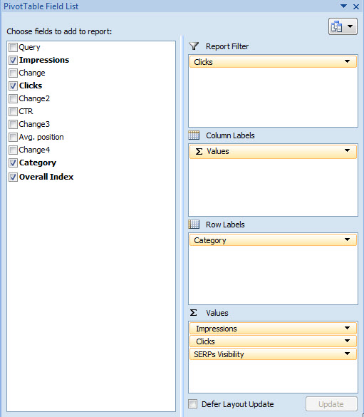
Create a pivot chart with our main categories, showing impressions, clicks, and SERPs visibility (our overall index).
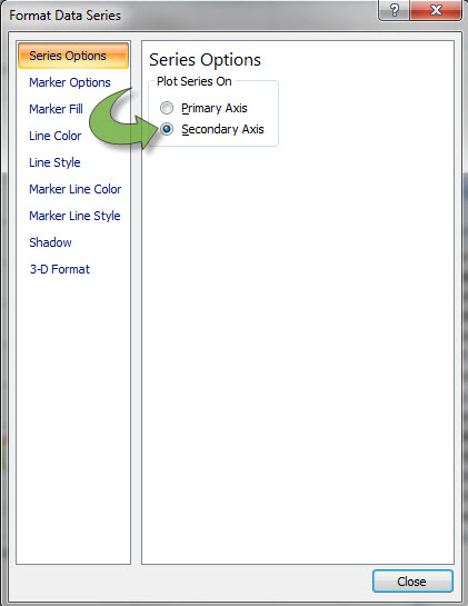
On the chart, select clicks and choose Secondary axis.
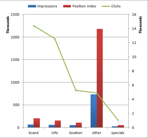
Change the chart type to line. You will see something like this.
In this chart, we see the number of impressions for the site along with SERPs visibility. It allows us to estimate, how often the site showed up in the results on the first two pages where searchers had a chance to notice it and click on the link.
Here are some of the conclusions we might come up with by just looking at the chart.
Brand is strong. There is good visibility, that generate a lot of clicks. Action: work on conversion optimization.
Info pages have some impressions, good visibility and a good number of clicks. Action: work on improving visibility of general info pages. Move visitors to your conversion pages.
Location pages are quite visible in SERPs. They also have high click-through rate. Unfortunately, there are very little impressions. Action: look for more geo queries that you can rank for. Start building links to those pages. Obtain citations. Look for more opportunities to appear in long tail geo queries.
Specials are not very visible. Clicks are few. Action: improve visibility of the specials pages. Optimize meta descriptions to encourage clicks from search results.
Other constitutes a large part of the website's impressions. It is very visible for many irrelevant terms. Action: consider these terms as negative keywords if you are doing PPC. Build relevance to conversion pages to off-set irrelevant query visibility.
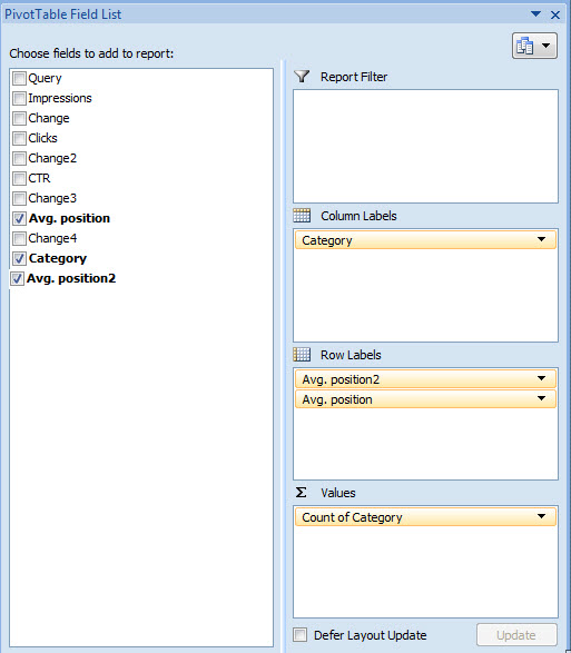
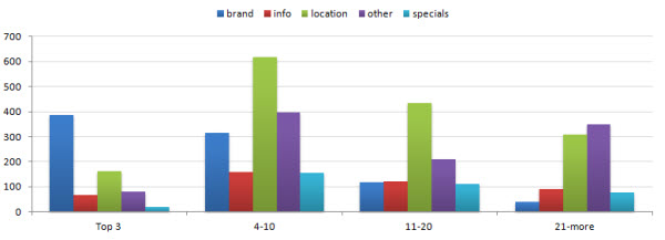
Finally, let's get some insight into your ranking by creating another pivot table. Add Avg. position to rows, Category - to columns. Select positions 1-3 in column A and group them by using Group Selection under Options. Do the same for positions 4-10, 11-20, and the rest.
You will see something like this.
You can see that brand is strong in top 3 positions, followed by location category. Specials are not at all visible in top 3 spots, but do frequently appear lower on the page. Location queries trigger results on the first page, but not the top 3 results. Info queries are not very prominent on the top 2 pages of SERPs.
My action list would start with achieving better results for location queries. Go through other queries and figure out why the site is showing for so many irrelevant queries. And finally, improve promotion for specials. These are pages that are supposed to directly lead to conversions, yet they are not very visible in SERPs.
These are just a couple of ways to get some actionable insights into keyword data that you can still get out of Google. How do you analyze your keywords?

