Google's Browser Size [ref]Browser Size[/ref] tool is a cool online utility which can show you for any page what percentage of visitors can see what part of the page without having to scroll.

And it's going away, [ref]Conduct Browser-Size Analysis Within Google Analytics[/ref] replaced with a site-specific view built into Google Analytics. The drawback is that you can't quickly checkout a site unless you can "quickly" add it to your own analytics account.
So, we came up with the next best thing: your own browser size tool.
Step 1: Grab The Overlay Image
You can do that here or, if that image is ever removed, here.
For Chrome users: upload the image somewhere. Make it accessible online.
Firefox users can move on to the next step.
2: add this browser extension
Chrome users install the WebDeveloper Image Overlay Extension.
Firefox users install the Pixel Perfect add-on (requires you also install the Firebug add-on).
Step 2: Point Extension to Image
WebDeveloper Image Overlay:
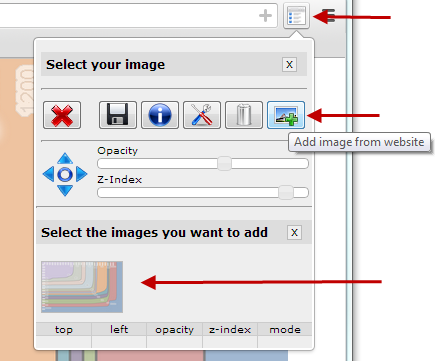
Navigate to our uploaded image's URL. Then click the extension's toolbar button. Click Add Image and select the browser size overlay.

Done.
Pixel Perfect:
Click the extension's button in the browser's status bar (bottom of the browser).

Click Add Overlay.

Browse to your saved overlay image and select it.
Done.
Step 3: Using Your BrowserSize Tool
Chrome:
- Browse to the page you want to analyze
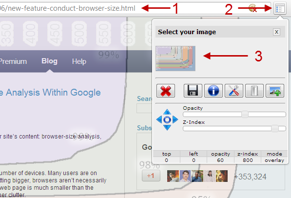
- Click the extension's toolbar button
- Select the browser size overlay image

Firefox:
- Browse to the page you want to analyze
- Click the Firebug icon

- If not already selected, select the Pixel Perfect panel in the Firebug console

- Pick the browsersize tool image (you can now minimize the Firebug console)

To Remember
- The overlay shows the inside of people's browser; the actual window on your content. It's not about screen resolution or browser size: it's about the viewport of the browser -- that what is really visible.
- Google's original tool and this alternative to the browser size tool work best with websites that have a fixed position hugging the left side of the browser. Many sites don't: they live in the center of the browser. Just make your browser smaller until both sides hug the edges of the page.
If you liked this post, you might also enjoy Make Your Own Twitter Button With Custom Text
