I stumbled upon a change Google seems to be testing for the search results page.
The change is visible when logged out of all Google accounts and is most apparent when viewed in a maximized browser window.
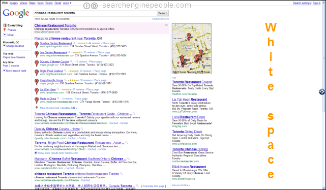
In the test the left margin is completely dropped and the search results are shifted to the left creating a large amount of space on the right for perhaps more local maps? paid advertising?
Check out this simple search for Chinese Restaurant Toronto. I love Chinese food 🙂
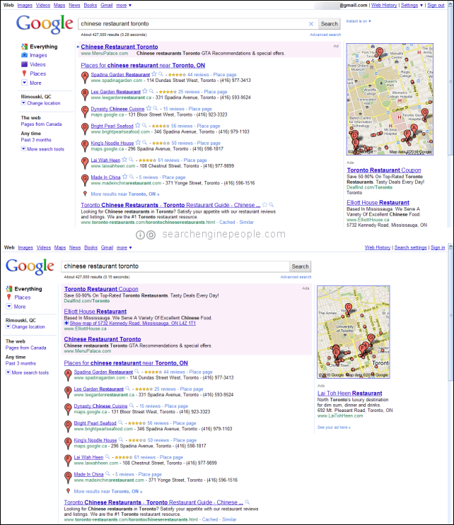
Regular SERP (Logged In)

* maximized browser window to illustrate white space
The traditional view with a white margin on the left and right of the search results; the space in the left margin has always been vacant.
Left Side Hugging SERP (Logged Out)
Now, when not logged into any Google account this is how the search results page look:

* maximized browser window to illustrate white space
Youll notice that all the results have been shifted to the left opening a large amount of space to the right of the map.
Before & After
As seen on a regular monitor, regular browser size.

Whats Up?
With instant previews overlapping the right sidebar and instant search changing what ads are shown at lightning speed, does Google need to free up this space to better make place for existing ad placements or is it looking to ad something new?
Here are some things Google may be planning for this enlarged right margin:
1. Video advertising
2. Social media integration with Twitter (Ed.: they wish!)
3. Enhanced local product offering
Try it for yourself, log out and try a search! What do you think Google is planning?
