The iPad is one of my favorite writing environments. Near-instantaneous on, super long battery, ultra portability, and especially the combo of lit screen and on-screen (silent!) keyboard make it a real workhorse.
But most writers will tell you there's something else that makes writing on the iPad just so: lack of distraction.
On the iPad every app is a full screen, singular experience. No taskbar in sight, no other windows; you are running just this app right now.
Still you can go a step further: select the most distraction free, frictionless writing app.
I did and here are some of my picks and their "why's".
Writing Kit

Its claim to fame is its in-app browser and in-app search. From those places you can insert links right away into the editor. It works really well.
I keep mistaking the little eye icon for search, not able to have my brain associate the testing tube with search instead. As a result I often see a preview of my document instead.
Writing Kit is one of the many apps that supports markdown. That's in fact one of the reasons I picked it. Once you start to sync between writing software and platforms you quickly learn all your neat formatting may get lost. Markdown helps plain text files have formatting.
Also like most other writing apps Writing Kit supports Dropbox. As of version 3 it doesn't have iCloud yet but I don't miss it. I'm a Dropbox user (free still). Don't know if that's because I'm a PC, had Dropbox installed already, or that I haven't looked into how I "see" and use my iCloud files from the PC to begin with.
In Dropbox Writing Kit makes its own folder and insists on being a total stranger to the rest of Dropbox, a habit of some apps I find terribly annoying.
The app adds a toolbar on top of your keyboard from which you can reach formatting functions like Heading, bold, lists, etc. Swipe the toolbar to the left to see more of it; extra characters, stuff like that.
These toolbars -- other apps have them too -- can reduce cumbersome keyboard toggling to get to certain formatting characters. Better yet, they can help you use Markdown-powered rich text type formatting without having to give it a second thought or learn any freaky syntax.
The toolbar is a regular button bar about half as high as the other rows on the keyboard. Sounds like not a lot but in landscape -- the only way I write on the iPad, really -- it means you lose quite a bit of real estate.
Also,the app has another toolbar stuck to the top of the screen to give access to the interface of the program. All in all I'm left with about 10 lines of text to work with. Not bad and as soon as you're writing you fall through the page and forget about the space, being in the word instead. Still...
With updating documents I find the app a bit doubtful. It happens that I edit a document elsewhere, come back to Writing Kit and there is no real way to force some kind of refresh. In case of the document that was this post you're reading even switching away to other texts and back didn't refresh the content and an old version remained in screen.
So why do I use Writing Kit? The theme option in its settings. Here I can switch from black on white to old school green on black. For a moment I'm back on my monochrome monitor or in WriteMonkey, the distraction free (and free!) writing software for your PC. And as I'm often writing in the dark it sure helps my eyes feel relaxed too.
Could I switch to night mode in the iPad settings instead? Of course; anything is possible. But I find that an annoying work around.
There are only a few other writing apps that support color changing like this. WriteRoom and Writings are two of them. The main reason I'm using Writing Kit instead of those others is that when I started to look for this feature I found it in Writing Kit which I already had on my iPad 🙂
ByRoom ByWord

Awesome. What a beautiful place to write. The Bang & Olufsen of writing apps. The writing space Steve Jobs could have designed.
From point of entry on, the app feels very light weight, airy even. Nirvana comes to mind.
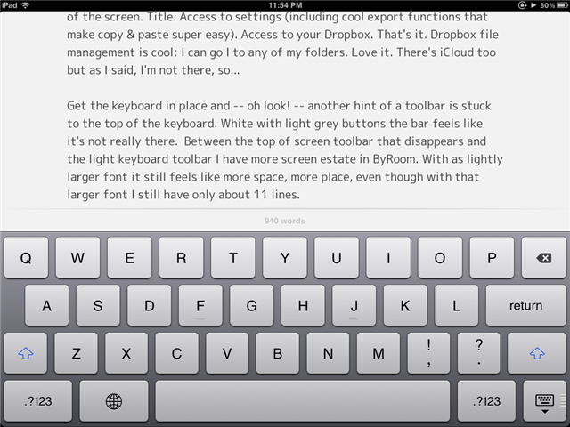
When the keyboard isn't visible a thin hint of a toolbar pleasures along the top of the screen. Title. Access to settings (including cool export functions that make copy & paste super easy). Access to your Dropbox. That's it. Dropbox file management is cool: I can go I to any of my folders. Love it. There's iCloud too but as I said, I'm not there, so...
When reopening a document from Dropbox (to get the freshest version of it) ByRoom also correctly recognizes that something has changed. It won't simply refresh your document but instead warns you there is a conflict between the local and remote version and which one would you like to keep? Win.
Get the keyboard in place and -- oh look! -- another hint of a toolbar is stuck to the top of the keyboard. White with light grey buttons the bar feels like it's not really there. Between the top of screen toolbar that disappears and the light keyboard toolbar I have more screen estate in ByRoom. With a slightly larger font it still feels like more space, more place, even though with that larger font I still have only about 11 lines.
In the default state of the keyboard toolbar you see word count only. Swipe the toolbar and you can get more buttons. These are (oh goodie!) cursor buttons. Up, down, left, right. You have no idea you will like these until you have them, switch to another app and then miss them. Instead of fake-ish bold/italic buttons there is direct access to the * because wrapping words in one of those gives you italics, two would give you bold. You likewise have access to brackets. Those buttons change state: tap the button, the bracket is inserted and the button switches to the corresponding closing bracket. Smart.
ByRoom ByWord comes as close to "full screen" distraction free writing as you can get on the iPad.
Pure pleasure to use. Most unfortunately it only has black on white. No color schemes or night mode.
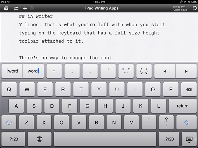
iaWriter

The editor with the least amount of space. Crammed and cramped. Claustrophobic.
Which One?
Don't worry, I'm not going to leave you hanging here with a "to each his own" or something similarly vague.
For my money ByWord is the most beautiful, most aesthetically pleasing, most pleasant distraction free writing environment on the iPad. These people know design. The Markdown export to HTML is not special; export to email and copy to clipboard are.
I would always be writing in ByWord if it wasn't for the fact that sometimes I need and at other times desire green on black to write comfortably.
And so it's then that I switch to Writing Kit which for all it's quirks is a very good app. Would have remained my second choice but over time it has grown on me.
Of the apps the only one I really can't support -- or back -- is iA Writer. This is not pleasant to use at all and I wouldn't wish this on you. True, it's just 99 cents but add that to your purchase of ByWord which is 2.99 (50% off) for a while or give that buck to a kid and make them happy.
For beauty? ByWord .
For evening writing? Writing Kit.
Today. For you. Go forth and write 🙂
PS: what am I missing? How do you make writing on the iPad better?
PPS: If you liked this you might enjoy My IPad Blogging Toolkit And Setup
