(CTA): relates to conversion CTA is a specific message/graphic urging the user act. CTA Design is the art of moving visitors from one page to the next, and finally persuading them to take an expected, predetermined action.
Creating compelling and successful calls to action is part art and part science. The overwhelming tsunami of information on the web around this subject can leave the humble website owner unsure where to begin.
To remedy this I have put together a list of the 7 most common characteristics that can be found in calls to action that guide the user towards your designated business goal. The characteristics listed below can be applied to any site in any vertical; you just have to know what your goal is.
1. Benefits
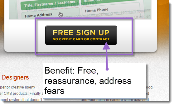
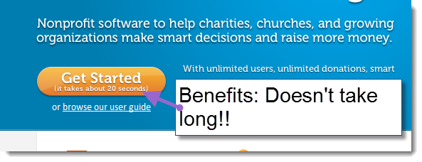
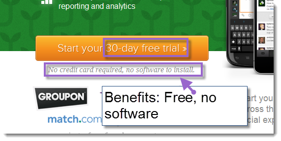
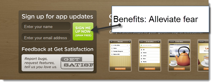
You need to let your users know what they will get if the click your button. Telling them that they need to download or sign up is fine but what are they going to get out of it?
See it in action: https://www.playintraffik.com/
See it in action: https://www.donortools.com/
See it in action: https://sproutsocial.com/
See it in action: https://www.tearoundapp.com/
2. Urgency
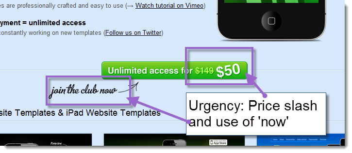
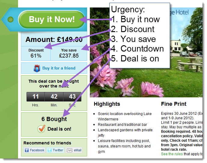
Ideally you want them to click on your call to action now rather than later - who knows who else they may come across who provide the same service or sell the same product. Including a sense of urgency will encourage the user to take action now.
See it in action: https://www.appstemplates.com/
See it in action: https://www.groupon.co.uk/
3. Size
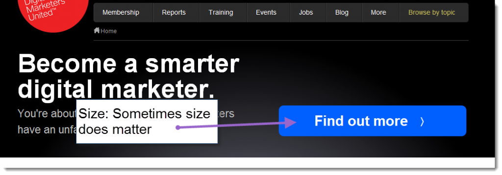
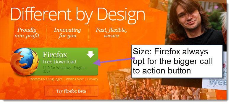
There is this cliche floating round that size isn't everything (allegedly) and whilst it isn't always best practice to have a page that is over dominated by a massive call to action you need to make sure that it is clearly visible on the page and bigger than less important information.
See it in action: https://econsultancy.com/uk
See it in action: https://www.mozilla.org/en-US/firefox/new/
4. Colour
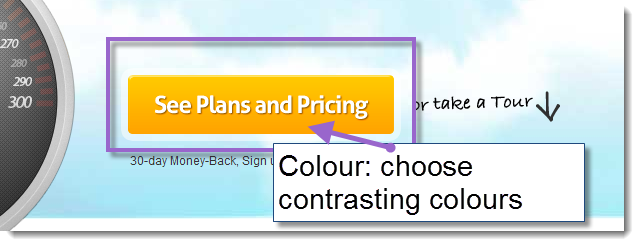
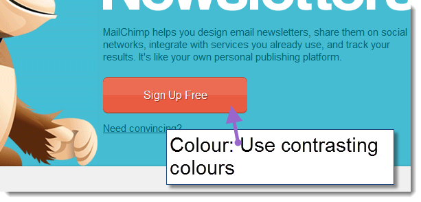
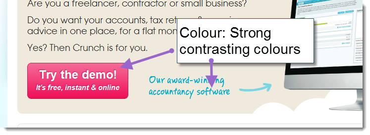
Use colour wisely to make sure that your call to action stands out from the other information on the page. Use a colour wheel to help you decide on contrasting colours or refer to this post by Ann Smarty.
See it in action: https://www.maxcdn.com/
See it in action: https://mailchimp.com/
See it in action: https://www.crunch.co.uk/
5. Placement
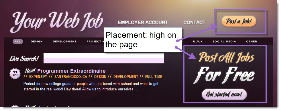
Make sure that your call to action is placed well above the fold in order to capture as many users' clicks as possible. A call to action that is left floundering, lonely, at the bottom of page is not likely to garner as much attention.
See it in action: https://yourwebjob.com/
See it in action: https://vimeo.com/
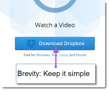
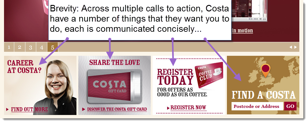
6. Brevity
Say what you need to in as few words as possible.
See it in action: www.dropbox.com
See it in action: https://www.costa.co.uk/
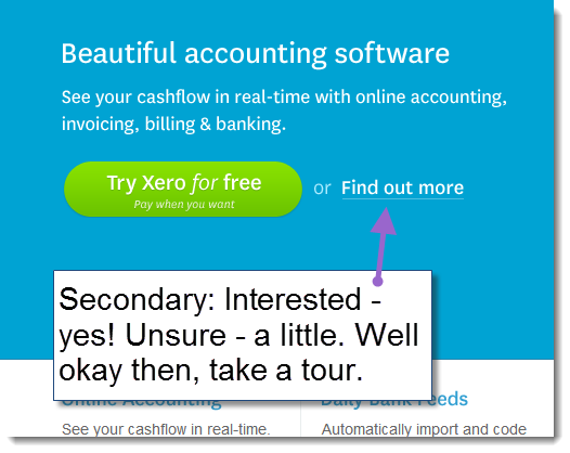
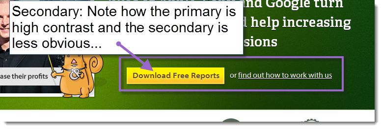
7. Secondary Options
Not all of your users are going to be ready to purchase/sign up/download straight away. Maybe your benefits and compelling sense of urgency haven't convinced everyone. Enter the unsung hero of calls to action - the secondary call to action. Offer a tour or a free trial, a white paper or testimonials to help convince the less sure.
See it in action: https://www.xero.com
See it in action: https://www.conversion-rate-experts.com/
Hopefully this gives you a primer on what you need to include when you are crafting calls to action that will guide your users towards the actions that you need them to take to make your business more successful online.
Learn More About Conversion Optimization:

