Next time you walk into a store take special care to notice your surroundings. How air conditioned is the space? What music are they playing and at what volume? Are there any unusual scents in the air you might not expect, such as desserts coming from a department store where no food is being served? What about the lighting?
All of these are common tactics used by businesses to encourage their customers to buy, buy, buy. Our brains react to certain stimuli, putting us in the mood to pull out our credit cards and pick up impulsive items we may not have bothered getting before we walked in.
Online storefronts do this, as well. Sure there is no air conditioning or lightning to consider, but design choices are incredibly important when it comes to taking those potential customers and converting them to real sales.
Color is an intense experience on its own.
~
Color is one of those brain triggers we can take advantage of, using certain tones to spark the mind into paying closer attention to what is being offered.
Your Brain On Color
Color psychology has become a bit of a controversial topic in the last few years. That is thanks to a misunderstanding of how the process works, with some publications giving tones and hues an almost paranormal level of power. They claim that just by surrounding yourself with yellow, for instance, you can cure depression.
Of course, the truth is much less dramatic than that. According to research, color can and will be interpreted through different lenses due to factors such as cultural significance, past experience and even just personal preference (one person's pink is another person's blue).
Culture is especially important to consider. Certain color schemes can have very distinct meanings that will leave an immediate impression on the viewer. For instance the color purple is considered to be one of wealth, richness and opulence in the US. In Brazil, however, it is a color associated with death and mourning, often used during funerals. In some Eastern countries white is a symbol of misfortune.
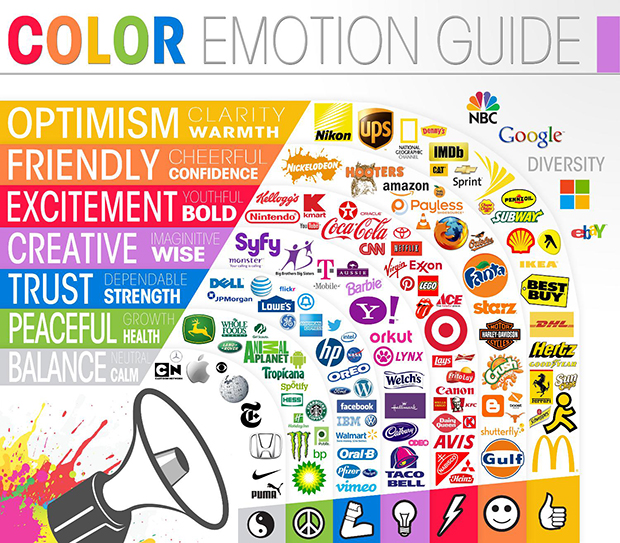
In spite of this, The Logo Company was able to find that in most situations certain colors evoke an emotional response that can help to narrow down a focus in branding. There are some that are largely universal:
- Red - Exciting
- Orange - Optimistic
- Red-Orange - Friendly
- Green - Peaceful
- Blue - Trustworthy
- Grey - Balance
- Lilac - Creativity
- Black & White - Nostalgia

Personality and Perception
That isn't all there is to it. An incredibly interesting study published in Sage Journals found that customers tend to like it when a color “matches” their perception of what a brand sells. If the color in logos or branded materials are incongruous the buyer may actually be put off of a product.
Companies have long since picked up on this trend and you can see color branding featured in many examples. Let's look at the different colors and see how their meanings stack up with certain logos:
Red (Exciting)
CNN uses red in their logo. They are a news agency that focuses heavily on breaking news pieces and are often one of the first to present new information. Having a color that signifies excitement is a good match for their tone. Nintendo is another that uses red. As a gaming console they don't want to make their players associate something calming or boring with their brand. They want them to think of thrilling adventures and the latest heart pumping game released to the market.
According to Salesmate, Charlotte-based sales management platform, red is also the seasonal color that works well for such holidays as Valentine's Day and Christmas.
Orange (Optimistic)
Nikon is a camera brand that sells high end photography equipment for both personal and professional use. Their use of the optimistic orange makes the customer think of the possibilities before them. It gives a positive glow to the future and what might be coming down the line. UPS also uses orange in their logo. The customer can feel confident and happy that their package is going to arrive safely at its destination.
Red-orange (Friendly)
What better use for a friendly looking color than a children's television network? Nickelodeon has long since used the blood orange colored splat as their symbol, as well as in ads featuring a big red--orange couch that was used for their teenage level shows. Mozilla Firefox browser uses the color for their mascot, a fox that wraps around an image of the Earth taken from space.
Red-orange thus makes a great call-to-action button:

Preply home page features a nice call-to-action button that stands out well!
Green (Peaceful)
John Deere tractors are a stalwart in the agricultural business. Part of what put them there was their iconic green logo with a deer bounding off, as though through a forest. BP, the controversial petroleum developers, try to get past the negative image held by all oil companies (and themselves in particular following their disastrous spill) with a green logo that moves them far away from the expected blacks and browns.
Blue (Trustworthy)
Trust is a crucial feeling to convey for many brands, such as Oral B. They show that they can be trusted with gum and tooth health through their blue logo. HP and Dell are both computer brands that show the same style, pushing an image of their products as long lasting to get past the high price tag.
Grey (Balance)
Usually done through a metallic design, gray is a balanced and neutral color that doesn't evoke a strong emotion. For brands like Apple this is a strength as it seems modern, efficient and beyond the need for color. Wikipedia uses the same color but with a different meaning: it promotes a sense of impartialness, with cold data without bias.
Lilac (Creativity)
SYFY uses purple to advertise their network and it is a great choice. Known for knock-out bizarro hits like Sharknado, they are definitely a creative bunch, for better or worst. It also adds a touch of silliness, something else they are known for. Yahoo also uses lilac, though more as a casual color that people can connect to on that level.
Black & White (Nostalgia)
You will usually seen this type of branding from old and trusted sources that want to maintain an air of integrity, such as the New York Times. But other brands like Nike use it as a classic touch that shows their name as synonymous with classic.
Color and Conversions: Case Studies to Consider
With that in mind, let's look at some actual case studies on how the color choice influenced the conversion rate:
Orange:
Unbounce declared that the future of call-to-action buttons is BOB, i.e. Big Orange Button.
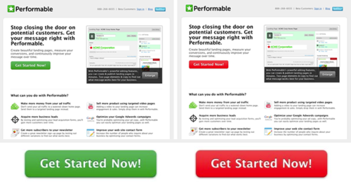
Red Vs Green:
Dmix found that conversions increased by 34% when they used red button. It looks like in this case, the "red" was actually orange-red

HubSpot confirmed that experiment using the purely red button.

However in this case, it looks like red simply stood out more because the site incorporates green in their logo and overall site palette.
Takeaways:
- Generally, orange and red work better for calls-to-action buttons
- Many colors may work for your calls-to-action as long as the button stands out effectively. It's more about overall design and layout than one particular color really. Basically, any color change increasing the visibility of your CTA button is likely to up your conversions. Hence, if your site has a lot of orange, an orange button is unlikely to improve your conversion rate.
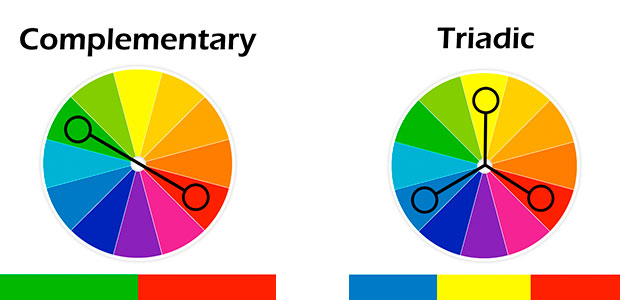
To give you some more guidelines, to pick an effective CTA button, pick wither a complimentary or triadic color from the ones you use throughout your site:

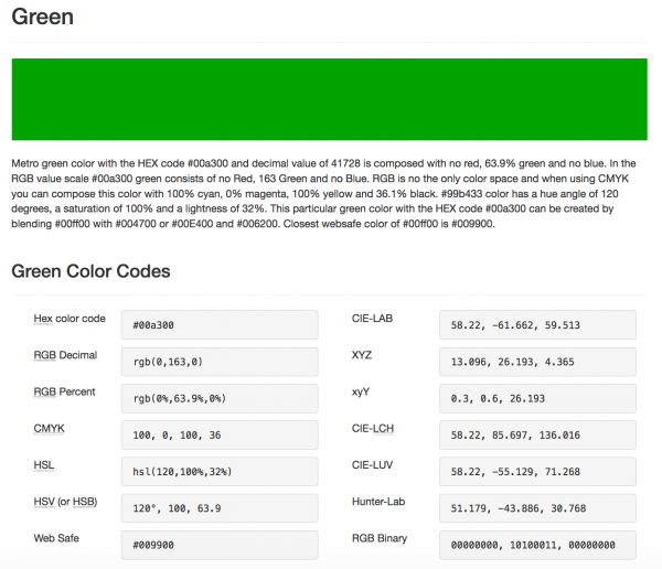
Colorlib has a nice tool allowing you to pick best-matching colors to then contrast them more effectively.

Do you have an example of how color has been used for conversions? Let us know in the comments.
Hand-Picked Related Articles:
- 3 Psychological Tools To Use In Landing Page Design
- The Psychology of Conversion Optimization: Anatomy of the Brain
- The Importance of Color & Contrast in Increasing Sales and Conversions
* Adapted lead image: ![]() Public Domain, pixabay.com via getstencil.com
Public Domain, pixabay.com via getstencil.com
