While these phrases are affiliated and sometimes mistakenly interchanged, they are not the same thing. One is a design convention while the other is a content delivery method. Although they are often used together in website construction, neither is a requisite of the other. A site can have either parallax or infinite scrolling, or both. These concepts are relatively new to the industry, but their conventions, or lack thereof, have been a challenge for UX and SEO.
The Parallax Effect
So what exactly is "parallax"? No, it's not a comic book super-villain (though some might consider it villainous nonetheless).
The term refers to a visual effect that involves moving two or more superimposed layers, where objects in the foreground are faster and larger than those in the background.
It was originally used to simulate depth of field in movies and gaming, and it eventually found its way into web design. The good news is that, despite having to work around some best-practice implementations, parallax doesn't have to be a bad guy.
Not everything has to move up or down as the user scrolls on a parallax page. You can still have key elements stay put even as everything else disappears from view. Pages don't even have to scroll at all, as seen on France's SNCF Engineering Challenge (just skip the video). Even on a feature-rich site, you can still maintain conversion points and keep the quality of user experience high.
A Bottomless Page
In an "infinite scroll" build, a site's content is delivered in a seemingly never-ending fashion, as though everything was put on a single page. The page itself isn't really bottomless, just very long. This type of architecture can be built literally, as in a true "one-page" site. Alternatively, a continuous scroll can be simulated using JavaScript or AJAX.
Scripts can be used to load an infinite scroll's subsections on-demand or all at once. The text and imagery for each area are taken from actual pages, be they static files or entries in a CMS. Grabbing everything in one go allows for quick traversal when moving down the site, but it requires initial loading time and can even cause a browser performance hit if the content is heavy on imagery. Getting content on the fly - usually based on scroll position - is easier on browser processing and removes the delay on first-load but sacrifices speedy perusal thereafter.
Axara fashion shows a fine example of infinite scrolling, complete with well-defined page states, minimal transition effects, good in-browser performance, and sticky navigation.
A Few Other Things To Keep In Mind
- Build the site with optimization first in mind, and ensure that each page still has its own URL and remains accessible even if JavaScript were to be disabled. Then, decide how you want to implement these extra features.
- Be wary of the limits to optimizing a parallax site, and employ best practices for infinite scrolling.
- Have a mobile version of your parallax site. The processing power required to render the effects would be too much for the majority of phone and tablet browsers. In many cases, the site might not even display properly.
- Paginate the subsections in a single-page construct, and provide means of navigating quickly to each without forcing the user to trudge all the way down or back up.
- The overall layout of individual areas in an endless page (with or without a parallax) doesn't have to change. Place conversion points where you normally would in relation to the rest of the "page".
Jquery Tools To Get Started With Parallax Scrolling
as suggested by Nigel Ayow
Stellar.js
Superscrollorama
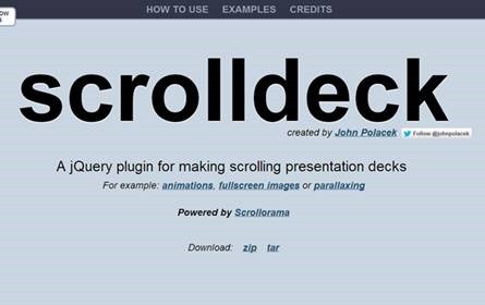
Scrolldeck


