When it comes to creating your website-whether you're talking about content, design, or function-the biggest element to consider is always readability.
It doesn't matter if your colors are perfectly calibrated and your images pop up into a lightbox display. Netizens are constantly inundated with content, and they rarely read anything in-depth. They scan the elements that stand out the most and decide whether or not it's worth a full read. This means that unless a user can figure out what your website is trying to say (and sell!) in less than a few minutes, they're not going to stick around.
And it doesn't just mean that your written content needs to be concise. It means that every element of your design needs to draw the user's eye along the path YOU want them to follow. If the goal of your landing page is to get them to fill out an email subscription form, then that form should be the focal point of your design. If you want them to purchase your product, you need to highlight the product and give them multiple points of sale on the page.
Not sure how to get your design flowing like you need it to? Follow these steps to make sure your elements are aligned.
1. Think Ahead
Every page of your website should have a goal. Whether that's to inform a consumer about your product, get them to convert, or simply just provide value to further customer loyalty, you need to know what you want to do with that page before you ever begin to consider design.
Yet most website owners out there don't have the time or expertise to design a new layout for each individual page. Even working with the framework of a CMS like WordPress, where every page has a variation of the same layout, you can tweak the content and images on the page itself to draw attention to the most important content on the page. You just have to know what the most important content is.
2. Think Simple
Remember, you want your users to be able to scan your content easily. If your website is too busy, your content and products will get lost. You need to have a streamlined, consistent structure for each page.
One way to do this is through color. Certain colors incite different emotions, and choosing the right color scheme can inform the user about your message before they even see a picture or read a single word.
Another is the size of your design elements. To put it simply, bigger font gets read first. Bigger images get seen first. The eye is naturally drawn to bright and bold, and you can take advantage of that.
For example, Shopify, a company that sells mobile POS systems, breaks each page into sections that feature one big headline and one image to highlight various features of its products. Looking at this screenshot from their electronic POS system... (https://www.shopify.com/pos/electronic):
You can see how easy it would be to get a sense of what this product is and what it offers even scrolling quickly through the page.
Shopify then ends each page with a testimonial, and a call to action. The call to action (a "Get Started" button) flows naturally as the endpoint of the page, the culmination of the product pitch presented in the page.
Other things to consider when keeping it simple:
- Only have 3 fields in any form. Forms with more than 3 fields have a significantly lower conversion rate than those with less than 3.
- Don't use more than 5 fonts or font sizes.
- Use subheadings to structure long pieces of content.
- If you are using ads, make sure they blend with the design. Keep ads contained to the header, footers, and sidebars. Ads that break up content or appear randomly placed is off-putting.
- Make sure your images are properly sized to fit within the box or column. Oversized images will clutter your design, while undersized images will look unprofessional.
3. Think Accessibility
Say you've designed a stellar first page, and your visitor is interested in learning more. Great! But say you've buried your navigation bar at the bottom of the page, or haven't provided a link to your contact page? You need to make sure anyone visiting your site can easily find their way to what they want most.
If you are trying to build a community around your site, be sure to put links to your blog and ALL of your social profiles on your site! As someone who has scanned hundreds of sites and tried to connect, it's extremely frustrating to spend several minutes trying to find the right links.
One way to achieve this is to have a fixed navigation menu at the top, bottom, or side of the page, which will be visible regardless of how far a user scrolls down. While you don't want this bar to be so large it overwhelms the design (especially in the case of mobile response designed sites), it can be a great way to make sure users are aware of what content you have to offer, and where you want them to go.
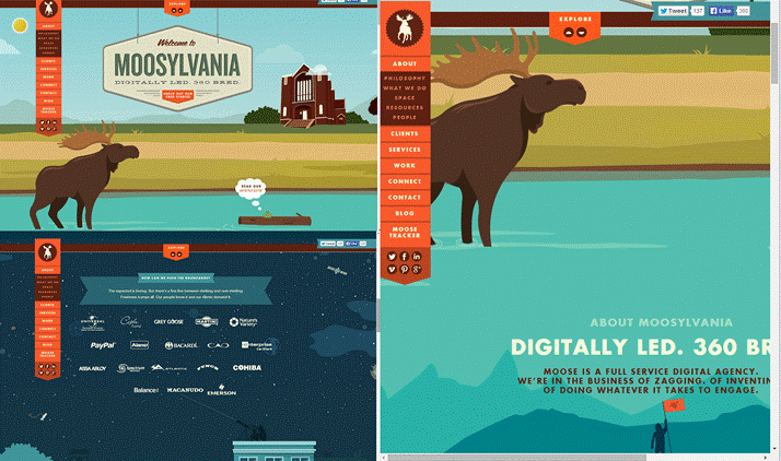
One of our favorite sites is Moosylvania, a digital agency that has designed its website around a Northwestern theme. They have a navigation menu that's not only fixed, but moves according the screen size it's being viewed on:
This again relates back to the idea of the goal of your website. You need to know not only what YOU want your visitors to do, but what THEY want: what content they want to see, what actions they'll take, what results they want to see. Anticipate questions or issues they might have with your site, and incorporate those features into the design.
4. Think Mobile
We mentioned mobile responsive above, and it's an extremely important element of your design. As early as Oct 2013, time spent on online retail on mobile devices surpassed time spent on PCs. You must have a website that is aesthetically pleasing on mobile devices as it is on a traditional web browser.
Early on in the mobile trend, sites would create a designated mobile-formatted site (the URL would appear like: https://m.examplesite.com). While these https://m. sites provide a better mobile user experience, they also require a separate design and separate site structure to turn the original layout into mobile-friendly design. A hassle for the web designer and the user as well, as these sites often drop some web features or functions in order to adapt.
Today, mobile responsive designs-which automatically reformat your content to best fit the device it's being viewed-are growing in popularity, and for good reason.
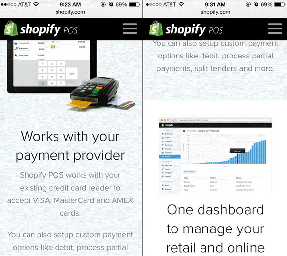
Take again the example of Shopify. Here's the same page on a mobile display:
The same content, the same fixed menu, simply resized and reformatted for a better mobile viewing experience.
It's All About User Experience
All of these elements are part of user-focused design. You need to have a website that is readable and streamlined. It should have clear navigation and content that is focused on the user wants just as much as what you want to display. With a strong user-focused design, you'll get people to take notice of your website and WANT to learn more.
Have you incorporated readability and user experience into your design? Share your thoughts or questions in the comments!


