Here is a list of 10 conversion optimization tests that surprised, enlightened or inspired us (or did all three of it) at Visual Website Optimizer.
1) Getting rid of drop-down menu increases revenue
You have surely heard about how conversion-centric designs help improve usability. This case study elaborates this best practice.
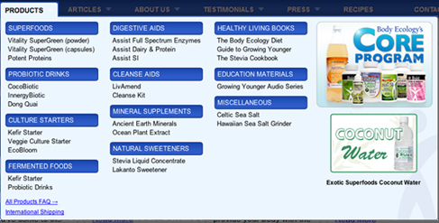
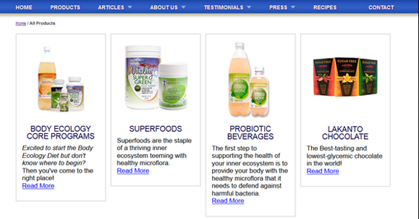
BodyEcology.com had a drop-down menu showcasing a complicated range of health products.
Frictionless Commerce, its consultant, used Visual Website Optimizer (VWO) to replace the menu with the product category page. The new design had a brief introduction for every product category (see below). The result? 56.43% increase in revenue!
 (Click here to read the full case study)
2) How creating one landing page raked in $1 million
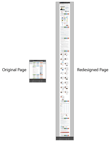
Shorter pages or longer pages? Minimal text or exhaustive text? If you opted for shorter pages and minimal text, then this giant of a test conducted by Conversion Rate Experts for SEOmoz (now called Moz) will surprise you.
The four-month test had a very systematic process of first getting customer feedback to create an optimized landing page and then coming up an extremely low-risk offer. To list all the learnings of the study will be beyond the scope of this article, so go ahead and read the full case study here.
3) Using persuasion principles can boost conversions
This test tells you how a simple textbook implementation of Robert Cialdini's persuasion principles from the classic 'Influence: The Psychology of Persuasion' can boost conversions.
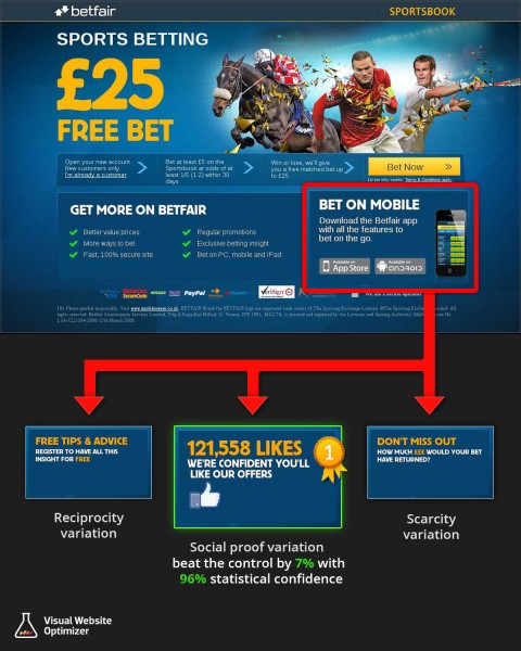
Betfair, an online betting platform, applied the principles of Reciprocity, Scarcity and Social Proof to create three variations of a landing page. The one which had social proof increased clickthrough rate to the registration page by 7%.
 (Click here to read the full case study)
4) Right placement of testimonials on landing page increase downloads
It's not just enough to know what all elements to put up on your landing page. Their placement is equally important as one needs to keep in mind how each element will support the decision-making process of the prospects.
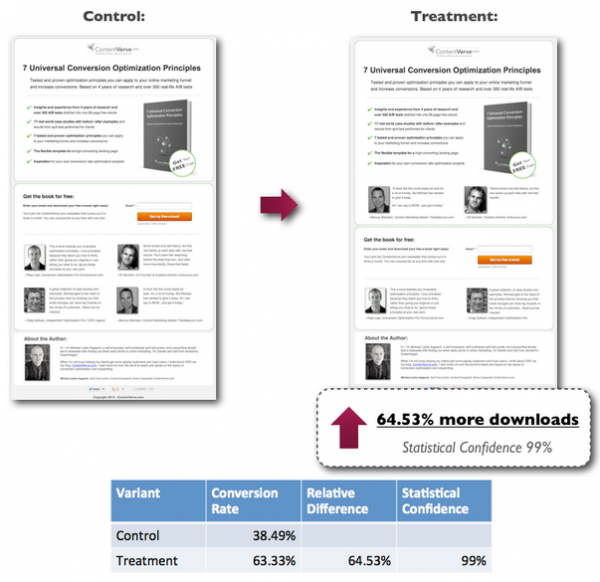
Michael Aagaard of ContentVerve tested the placement of testimonials on his ebook landing page. The first version had four testimonials placed below the CTA while the second one had them evenly spread before and after the CTA. The second version accounted for 64.53% higher downloads.
 (Click here to read the full case study)
5) Replacing baby elephant seal photo with silver pendant doubled revenue
Sometimes, just using a more relevant picture can lift conversions. Marine Mammal Center rescues sea lions, seals and other mammals in distress. It encourages visitors to shop with its e-gift store and the money goes towards the welfare of the rescued mammals.
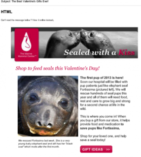
On Valentines Day, they ran an e-mail A/B test. Half the recipients got an e-mail asking them to 'Shop to feed seals this Valentines Day' with the picture of an adorable pup below.
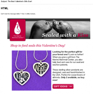
The variation, on the other hand, had a picture of one of the products at the e-gift store -- a silver pendant.
Though the two versions had equal clickthroughs, the second one resulted in more purchases, almost doubling the revenue.
(Click here to read the full case study)
6) Tweets with images generate more leads
Social media is an indispensable part of online marketing strategy today. Each post and tweet can be optimized to generate more leads.
HubSpot did exactly this when it A/B tested two sets of tweets -- one with images and one without. The former registered 55% increase in leads and 33% increase in visitor-to-lead conversion rate.
(Click here to read the full case study)
7) Reducing buyer anxieties lifts sales
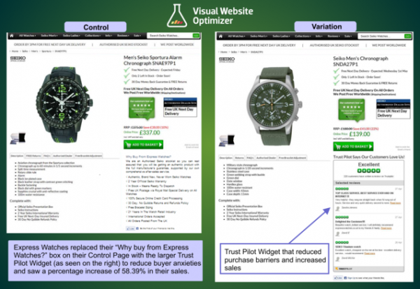
Perceived fear is one of the biggest roadblocks to conversions. Express Watches ran an A/B test by adding a prominent customer review widget on its product pages. This assuaged the buyers' fears and lifted sales by a handsome 58%.
 (Click here to read the full case study)
8) A/B testing four different privacy policies on a sign-up form
A clear, authoritative and credible privacy policy works better than a generalized, 'We keep your personal information secret' message. Also, if you like being straightforward and say something like, 'We won't spam you,' you might want to rethink the usage of spam. It could do more harm than good.
This is what Michael Aagaard found out after he ran four A/B tests on the homepage of a betting community. The winning variation increased sign-ups by 19.47%.
(Click here to read the full case study)
9) Prominently displaying paid plans increases subscription
If your business challenge is to increase the lifetime value of your customers, then you can take some insights from this case study by WiderFunnel. A complete redesign of the homepage with prominent display of paid plans increased Zoomerang's paid subscriptions by 81%. This effectively lifted its revenue by 58%.
(Click here to read the full case study)
10) Masthead overhauling shoots up lead generation
Sometimes it takes more than small tweaks to see big results.
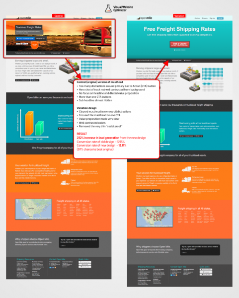
OpenMile did a complete overhauling of its masthead to lift lead generation by 232%. Some of the changes made by them were removal of its hero image, change in background color, removing distractions around the CTA, communicating a better value proposition in the headline and changing the CTA text and color.

