
The user experience of a website is an integral part of any web strategy. Users are the only ones who determine the efficacy of your offering. Therefore, it’s a good idea to make sure their needs are represented throughout the design process. Each decision should be centered on how it will affect the UX, and adjusted according to these parameters.
This is, of course, much easier to say than to put into practice. Still, there are some primary tenets to follow. Below, you’ll find the 5 fastest ways to keep users at the forefront of your designs, increase visitor engagement on your site, and ensure you have a fantastic UX.
1. Content First
The number one mistake designers make when crafting a new site is to do so without any idea of what content will go on the page. This often isn’t the designer’s fault. Many clients will come to the designer without a clear content strategy, and just ask for a website that meets certain constraints.
The problem with this approach is that the site owner must fit content into a mold that wasn’t necessarily designed with that content in mind. The result is a poor collaboration between content and design.
Imagine, for example, if AirBnB designed their homepage as a grid system knowing that they would want to describe different popular destinations in separate content boxes all along the page. That would be all well in good, except the first and most important piece of content you see on the AirBnB homepage is an interactive microinteraction that allows travelers to choose their destination. This interaction spreads across the whole screen, not fitting nicely within a grid structure.
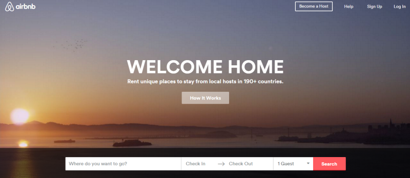
If the designers for the site had paid no mind to the content they were designing for, and instead concentrated solely on putting together an attractive page, they would have had to begin again from scratch.
2. Forgetting To Iterate
The problem with design these days is that it’s far from static. The design process is ongoing—dynamic. You can’t be satisfied with a design that’s been user researched and run through scenarios only once. You’ve got to A/B test, examine analytics, take surveys, conduct user interview, and then reevaluate what’s working and eliminate what isn’t.
A design isn’t finished after a single iteration. You’ve got to go back and adjust pain points and remove user friction. In short, examine your engagement statistics and reiterate where necessary. Such analytics you should look over include:
- Bounce rates on various pages
- Time spent per page
- Unique page views
- Events
- Conversions
For more on iteration, check out this guide to the Agile UX process.
3. Easy Navigation
Difficult to navigate websites are engagement killers. You might have the greatest content in the world but if it doesn’t flow, your traffic is just as likely to bounce as it is to interact. Try to use intuitive patterns that your visitors will be familiar with, such as:
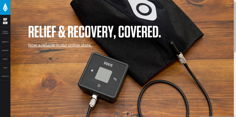
Sticky Navigation
The controls stay fixed to the side of the screen:
Menu Toggles

Notice the menu button in the top right corner? When you click it the hero image is replaced by a full screen menu:
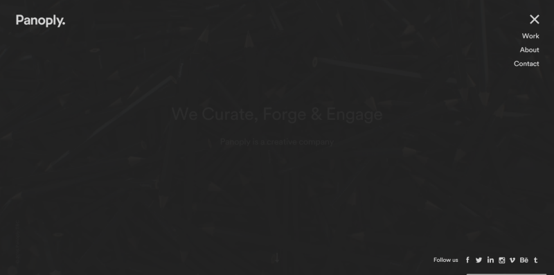
Whichever patter you use, always make sure that navigation options are never more than a quick scroll or a couple of clicks away.
4. Invisible Microinteractions
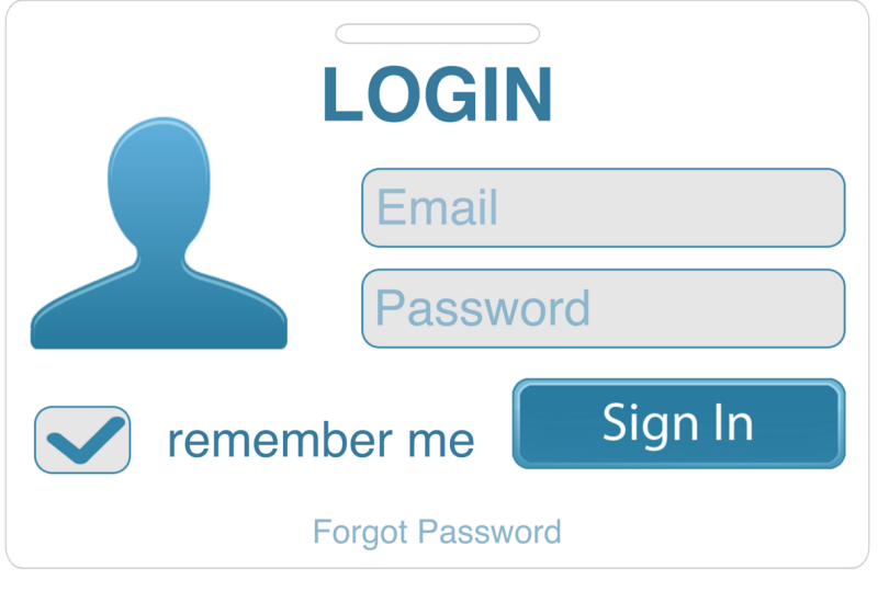
You require information from your users, that’s what engagement is all about. You provide value and they provide action or input. Their input may be something like a mouse click, hover, or another innocuously trackable analytic. Regardless, you want to make sure that providing the information you require is a painless process.
For example, in the picture above the user’s information can be saved, negating the need to enter login info every time they use the service. This saves time and makes a necessary interaction next to invisible.
5. Loading Time
Nothing kills engagement like loading times. Google recommends a loading time of no longer than 5 seconds, but a noticeable drop-off in user interest occurs after even 3 seconds. This doesn’t seem like a long time but as you watch a screen load up piecemeal, 3 seconds can seem an eternity.
To speed up your site, take a look at this in depth post on the topic.
What other ways can you think of to improve UX and increase visitor engagement? Leave your thoughts in the comments.
Hand-Picked Related Articles:
* Lead image adapted from Jeffrey
