Retailing online is an experience in itself. It has its own share of unique challenges, and etailers must never forget that it is "conversions" that provides them their bread and butter (and jam). So how can you run an e-business and simultaneously be the conversion ninja - one who is agile, adept and exceptionally good at converting visitors into customers on your site?
Being a conversion ninja is a process, and it has a lot to do with the learning you gain after you experiment with on-site elements while you continue to test and re-test your results. Here are a few hacks you can adopt that will enable you to speed up the process of gaining expertise in conversions.
The Right Words
"It's only words..." (sang Bee Gees and then Boyzone) that can be chosen, tested and then applied to your web pages at the right places. Using the right ones can increase your conversion rate.
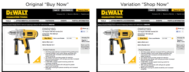
Power tool magnate Stanley Black & Decker, a Fortune 500 company, stumbled upon this fact while putting together rigorous, market-research aided testing plans for the overhaul of their Dewalt brand website and. In one particular test the team pitted two "CTA" words - Buy Now and Shop Now - against each other on product pages.
The tests revealed that "Buy Now" was the winner with 17% more clicks than "Shop Now" and DeWalt was happily poised for a six-figure revenue increase by sticking to it.
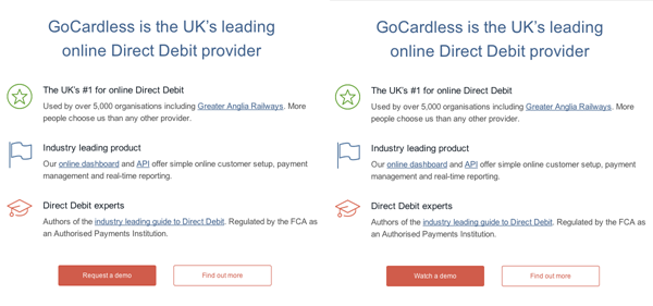
In another instance, GoCardless, a UK based online Direct Debit provider, wanted to improve the conversion rate for demo requests. Just like DeWalt, they substituted - literally - one word.
The "Request a demo" button was changed to "Watch a demo." Associated wording on the homepage, as well as the headline of the form to which this button led, was also changed. The result? An astounding increase of 139% in conversion!
As you can see in the examples and images above, there was no other change in page content, structure or imagery; consequently, any difference in CTR could be attributed purely to the persuasiveness of the button text.
Repetitive Image Attributes
Would increasing the image size of a popular item also increase its sales? Does putting up a bigger picture of the product you are promoting help? Do people get bored of seeing images of products with similar attributes on the same page? Do people focus more on the page if product images of different sizes are shown together? Etailers try to find answers to such questions by testing.
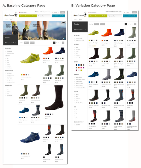
SmartWool tried to experiment with their layouts to see which one worked the best with their visitors. They had a uniquely designed category page 'A' with product images of different sizes arranged in alternating patterns. It was compared with a layout 'B' that had product images of the same size aligned in regular rows-and-columns layout.
The results were surprising to say the least. Data gleaned from 25,000 visitors showed that the aesthetically typical-looking 'B' layout had a 17.1% surplus in average revenue per visitor. The lesson? Using similar sizes and attributes enables quicker and steadier eye tracking when you're scanning or comparing a large number of images.
Tips In Product Description
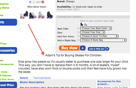
If you include a tip from a professional or an expert in your product descriptions, would it help move the product? One would tend to think so. The definitive answer to this question was found by Adam Lean, a roller skates geek and founder of RollerSkateNation.com. Adam wanted to provide a better and "real-life" friendly experience to his online buyers. He started offering his expert advice and suggestions as part of the product description.
The A/B tests revealed there was a growth of 69% in overall purchases and a massive 99% upsurge in revenue after the addition of Adam's pro tips. The results also proved that the positioning of information and text is also important. The variation shown here (with the tip below the details and pricing box) did better than one where the tip was placed inside the box above the pricing.
Bargains, Bargains Everywhere
Every brick and mortar store worth its salt knows that putting up large "Sale" or "Discount" signs on their shop windows is a sure fire way of drawing attention and reeling in shoppers into the store. Many stores even print your total "savings" on your final receipt to help you feel like you walked out of the store with a great deal.
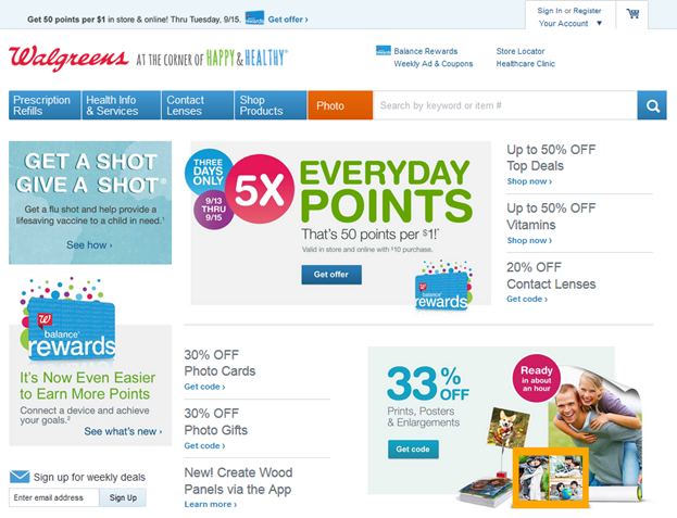
Nearly all of Walgreens' home page is taken up by deals, offers and details of how to earn more reward points.
Nothing stops you from taking a cue from offline retail and adopting this practice in your ecommerce store. When a user adds an item to their shopping cart, also add up the savings they make via discounted prices for all the items in the cart. Display this amount prominently as a means of tempting the user to complete the purchase in order to bag the awesome savings that you have highlighted. It'll work for one simple reason. No one likes walking away from a good bargain.
Enclosed Checkout
It's official. According to popular study, urban humans now have a shorter attention span than goldfish. From an attention span that lasted 12 seconds in the year 2000, we clocked in at 8 seconds in 2013. Clearly, the ever increasing clutter that surrounds us both online and offline means distraction is a perennial state of being. Care to guesstimate what the stopwatch will show in 2020?
Help your customers focus on the most important task - completing the purchase - on your site better by removing anything that might distract their attentions. An enclosed, self-contained checkout process is a great way to minimize external diversions. Yes, you do want your users to browse around and buy more, but make sure that happens before they begin the checkout not during the process.
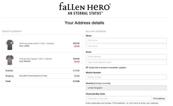
Fallen Hero, the men's designer fashion store, has perfected enclosed checkouts:
No navigation away from the page, no headers or footers, no sidebars. In short, no distractions. Just buy it.
Minimal Data Capture
Are you testing the patience of your customer? Is your need and greed for data driving him away? Quite possible, if you're making him fill in boxes and boxes of information at the first go. You need to tactful when you collect customer data.
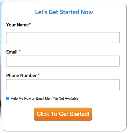
Form fatigue is a very real occurrence. Disruptive Advertising tested a lead gen form for one of their IT clients.
See that little checkbox with a blue tick just above the button? Adding it resulted in conversions plummeting by 5 percentage points (not percent, there's a difference) and 4,000 fewer clicks (a fifth of the sample size) on the button.
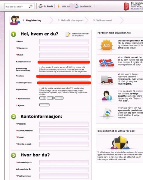
This is so important, I can't leave you without another example. BliVakker.no, Norway's leading online beauty retailer, removed three fields from their 17-field registration form.
Customer registrations went up 11%, leading them to simplify the entire purchase process over the next few months.
Capture just the bare essentials early on in the customer journey; other info can be collected down the line as your relationship with them improves. Many a time, having a simple "Save" button at the right place will do wonders. Until then, keep your forms short.
Recovery Emails To Win Back Cart Abandoners
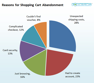
Shopping cart abandonment is a problem of humongous proportions for etailers. The average rate of cart abandonment in 2015 is 68%. In spite of retailers making their best efforts to woo deserting customers, the phenomenon continues to eat into profits. Customers provide many reasons why they leave halfway without purchasing:
Look at your web analytics and metrics to find pages on your site with biggest bounce ratios. Your numbers should give you an idea about the persona of the individual buyers and the reasons due to which they are ditching your site.
With this information, you can draw up a good email strategy to regain business. Send them the pictures of the goods they left behind. Tell them all they're missing. Restate the fact that they may lose out (FUD alert) if the goods sell out. Point out the exact steps for going back and buying again.
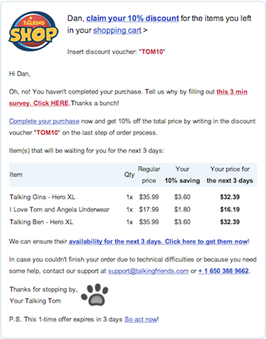
The below email from Talking Shop, despite being unassuming, does it all. Further, it actually asks people why they abandoned their carts in the first place - a great way to make that pie up there smaller.
Email Segmentation And Personalization
It is important to know your customers' online habits. Fashion retailer SwayChic (now Echo Club House) harvested data on customer behavior. Based on past purchase data, they divvied up the recipients into categories such as one-time, periodic or loyal customers.
SwayChic also created an optimized email schedule for maximum engagement based on pre-existing analysis of email open rates on various days and times. Customers were then distributed into time slots on which emails were sent.
CTRs doubled. Revenues tripled. Period.
Personalize your email copy based on the user reading it. For each email with distinct content, create associated landing pages with singularly different versions of copy based on key factors like the geographical location of the user, the time of the day, season of the year, whether it is a new user or a returning user, and so on.
Dropping Drop-down Menus
Research has shown that drop-downs annoy your visitors. It makes for a less-than-pleasant user experience.
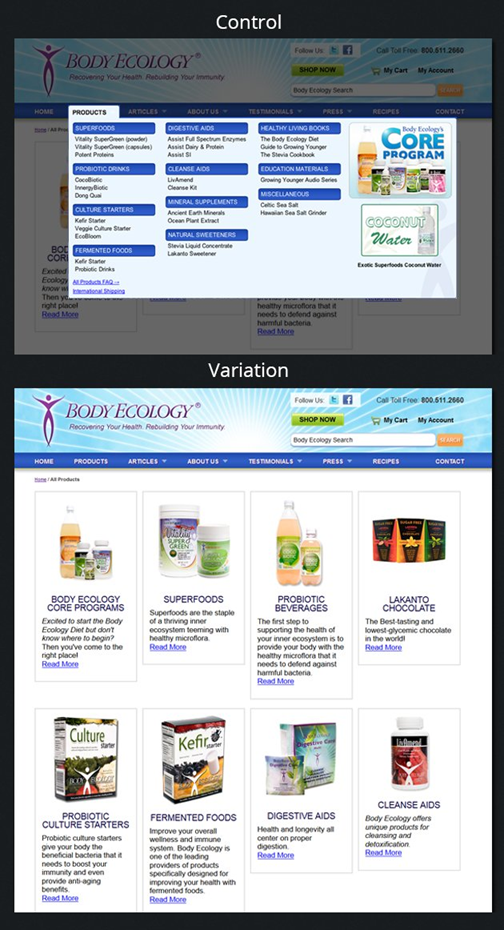
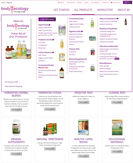
Is it possible to increase conversions by removing the standard, humble, ubiquitous, never-thought-twice-about drop-down? Body Ecology, a health products retailer, tested this out by removing the drop-down from their main menu and replacing it with a page summarizing category pages.
Body Ecology ran this test for two weeks; the projected annual growth in sales amounted to a staggering $230,880.
Needless to say, every business is different and so is every website or app. Mega menus have also been proven to work well for many businesses. Which is probably why Body Ecology now has both a mega menu and category summaries on its All Products section.
In A Nutshell
The takeaway from all these is that while it is challenging to go against conventions, A/B tests will help you defy them if you have a good hypothesis. Nothing can beat testing. Test your website, app and other digital properties and marketing platforms to form strategies and eventually find out all about your business.
Contrary to popular perception, it is extremely simple to build and modify a small ecommerce website - or mobile app, for that matter - as well as A/B test its pages. A DIY online retail platform such as Spaces (free) or Shopify ($9/month) gives you the flexibility to build customized landing pages, integrated with payments and the rest of the ecommerce works. Couple it with Optimizely (free), which will have you set up variations without much coding, observing visitors and analyzing click data in a few hours.
A good Ecommerce Conversion Ninja learns the hacks, gets inspired, experiments, tests, adapts and then reaps the profits. This is one rewarding journey - if you are already cruising along, please share your experiences in the comments.

