There are dozens of ways infographics can be displayed both online and offline, but perhaps the most popular format for visualizing information is that of a long, vertical scrolling design. This works perfectly for online sharing and reposting on blogs, but isn't always the best format for mobile viewing. In fact, the smaller the screen gets, the less impact a long <!--q:create a thumbnail with the exact visual hook you want your audience to see:q-->scrolling design will make on your end audience. So how do you ensure your infographic doesn't lose value in our mobile world? Here are 3 simple tips to ensure you produce a multi-device friendly design.
1. Limit The Length
While length isn't an issue on tablets, many smartphones won't display an image more than 5000 pixels tall! This has been fixed with iOS 7 but 1 in 8 iPhone users still have iOS 6 or older. Android and Windows smartphones also have older models with this same restriction. So, if you want to reach all mobile viewers, make sure your infographic is no longer than 5000 pixels. This will also ensure your content remain short and to the point, which is just as important as good design!
2. Create Thumbnails
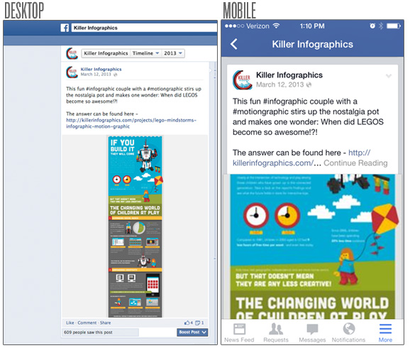
Mobile users spend 18% of their device time on Facebook and 6% of their time on other social networks. This means there's a great chance for your infographic to be discovered on popular social networks through an app versus a simple browser. In addition, most of these apps restrict landscape viewing on mobile phones, which makes sense since an overwhelming amount of users (90% in some cases) use their phones in portrait mode above all else. Because of this, it's important to consider how your infographic will display on social media applications. For example, if you posted an image in its full, vertical scrolling design, the standard Facebook app will crop the image wherever it sees fit. Here's an example:
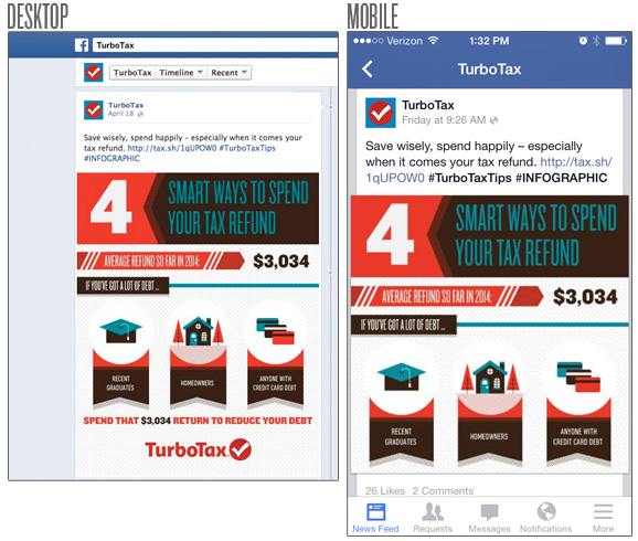
While this isn't too bad, it takes the control out of your hands. In fact, anyone interested in an infographic about LEGO, wouldn't even know that's what the above example is about due to cropping. By creating a thumbnail with the exact visual hook you want your audience to see, you have the opportunity to catch their attention faster and drive them to the full infographic on your website:
3. Create Mini Infographics
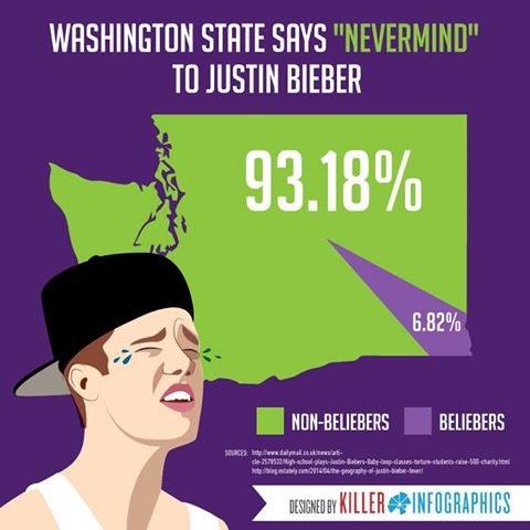
If you want to target a purely mobile audience, consider creating mini-infographics that just focus on a few related facts or statistics. These have sometimes been called "infograms" because people can easily send them to one another via their phones or tablets. If going this route, make sure the primary message is legible on the smallest possible screen without having to zoom in or out. The point isn't just ease of sharing, it's ease of viewing which means always designing for the lowest common denominator:
As technology advances, there will be new and creative ways to share infographics via mobile devices which will include better infographic creation apps, smoother parallax scroll interactions and more! While the methods of delivery may change and screen sizes may get smaller our hunger for data will continue to grow, ensuring a constant need for visual information. Planning a mobile strategy for your infographic campaign early is just another way of ensuring that information is as easy as possible for your audience to access on any device.
Next Steps:
- Once your infographic is created, familiarize yourself with the Best Practices for Promoting Infographics
- Infographics are an investment. Maximize your ROI with 5 Ways to Repurpose Infographics
