
Want to turn your landing pages into lead-generating machines? In today's ridiculously crowded online space, having a killer landing page is no longer a nice-to-have – it's a must-have.
The good news? You don't need to be a tech wizard or a marketing guru to create high-performing landing pages. You just need to know the basics and implement the right hacks.
In this article, we'll share our top 10 landing page tips to help you boost your SEO, increase conversions, and (most importantly) grow your business.
From simple design tweaks to content you’ve never considered before, these actionable tips are designed to help you get more from your landing pages – and get ahead of the competition. Let’s get started!
What’s the deal with Landing Pages?
Think of them as your website's grand entrance, where you get one shot to wow your visitors or watch them vanish faster than free donuts in the office. But most importantly, landing pages can be the place where your prospects become actual customers.
It's the place where people decide if they want to stick around and see what you're all about or if they’d rather binge-watch cat videos on TikTok. Nail this intro, and you're golden. Mess it up, and, well, good luck.
A landing page isn't just about cool web design trends—it's about creating a smooth, enjoyable experience that hooks your visitors, keeps them from searching the competition, and convinces them to do business with you.

Starting with the Basics
Before you start slapping on a bunch of AI-generated content and images, let's chat about the basics. First off, know your audience. I mean, really know them. Don’t just guess—they’ll smell your uncertainty a mile away.
How can you do this? Research. Speak to your current customers, analyze them. Use surveys, usability testing and user behaviour analytics. The more information you have, the better you can connect with your audience.
Also, set a main goal. Are you collecting emails, selling your newest product, or just proving your site isn’t run by bots? Whatever it is, keep these two elements in mind when making all your landing page decisions.
Remember, a clear goal keeps you from adding stuff that doesn’t help anyone and having the elements that your audience expects to find. So, focus up and make your landing page a lean conversion machine.

First Impressions Count
The section you see right after you open a landing page is known as the above-the-fold section. Think of your above-the-fold content like the opening act of a concert—you gotta play all the right tunes, or people will head for the exits. Especially considering our short attention spans nowadays (thanks TikTok).
Your headlines should be as captivating as those YouTube video thumbnails that you can’t resist opening, grabbing attention instantly. Pair that with compelling content and target keywords, and you've got yourself a winning combo.
This is your moment to shine, so make it visually striking and irresistibly engaging, but also make your offer super clear.
Dull and drab won’t cut it; confusing might buy you some time but won’t translate into conversions. Get this right, and your visitors will stick around long enough to see what else you have to offer.
Pro Tip: When running a PPC campaign, you can A/B test using a dynamic headline setup where the H1 heading changes depending on the search term used by a user. This will create a smooth, cohesive experience for your visitors.
Highlighting Your Unique Selling Proposition
Your Unique Selling Proposition (USP) is your secret sauce, the thing that makes your business stand out like a flamingo in a flock of Canadian geese. Make sure it’s front and center on your landing page, loud and clear.
Why should visitors choose you over your competitors? Spell it out in big, bold letters, and don't be shy about it.
This is your chance to shine and show off what makes you special. Whether it’s your unbeatable prices, cutting-edge technology, or stellar customer service, let your USP take the spotlight.
Effective Call-to-Actions
Ah, the Call-to-Action (CTA), your not-so-subtle nudge for visitors to do what you want. They tend to come in different sizes and colours or sometimes just text (if you are feeling less flashy).
When it comes to your landing page, mix it up with different types of CTAs to cater to those ready to commit and those who need a little more convincing. Remember, personalized CTAs can convert 42% more visitors than generic ones. So, get creative, make sure your CTAs stand out visually, and avoid sounding like a robot, unless you're marketing to other robots.
Use action-packed verbs like "Join," "Get," or "Discover" to ignite some enthusiasm. And please, no more "Click Here" buttons; it's 2025, not 1999. Adding a bit of urgency with phrases like "Limited Time Offer" or "Only a Few Spots Left" is particularly useful if you are selling a product or promoting an event.
Building Trust Early
Trust is like that elusive purpose everyone’s chasing. You gotta convey it early, or visitors will judge your landing page with skeptical eyes.
Show you're a legit business with trust signals—think accolades, brands you have worked with, glowing testimonials, or even a pic of you working hard (small business owners, we are talking to you).
If you're the new kid on the digital block, find clever ways to prove you're not a scam artist. Got certifications or awards? Flash 'em. Partnered with known brands? Drop those names.
Make sure you add at least a couple of those elements within the above-the-fold section to help you give the right impression.
Finally, don't forget to make sure your landing page doesn’t look like it was designed in the dial-up era. A professional and modern look will do wonders for your Credibility.
Not sure how a professional, modern page looks? Don’t fret; eyeball your main competitors or the brands you love, and they will give you an idea of where to start.
Addressing Visitor Needs
Visitors come to your page because they’ve got problems and they’re hoping you’ve got the magic fix. Channel your inner Sherlock Holmes and figure out what those problems are. Then, be their hero.
Communicating your audience's problem and pain points can be a good card as It demonstrates that you understand their needs. Outline how your product or service is exactly what they need, using language they understand—no jargon here, folks.
Be straightforward and hit them with the benefits, not just the features. And for goodness’ sake, keep it concise. They want answers, not an essay. Make it clear how you’ll make their lives easier, better, or at least less difficult.
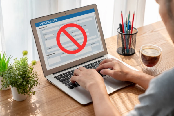
Simplifying Forms
Let's face it, forms aren't the most exciting thing to talk about, but they're a crucial part of conversion rate optimization.
If your landing page has one, make it as painless as possible. Users see many forms, but they rarely enjoy filling one.
Imagine you're at a crowded Government services place; nobody wants to be there longer than necessary. Keep it short and simple. Only ask for what you absolutely need—first name, email, maybe their favorite pizza topping if you're feeling cheeky.
Too many fields, and they'll drop off faster than you can say "conversion rate." The wrong format and users could get confused.
Once again, make sure to evaluate your page through the eyes of a new user that is not tech-savvy and has a short attention span.
Pro tip: If your campaign promises a deal or focuses on acquiring new customers, put your lead gen form front and center on your landing page. Make it easy for ready-to-convert visitors to take action.
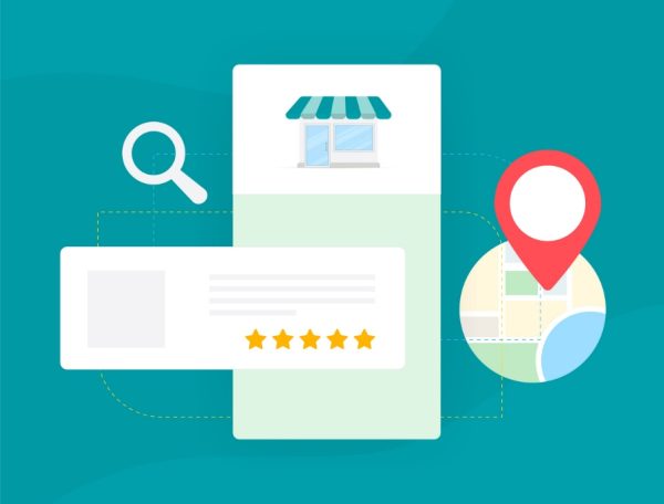
Leveraging Social Proof
Social proof is like a “bestseller” book sticker: when you see that thousands of others have bought and loved a book, you're more likely to think it's worth reading.
Got happy customers? Let them sing your praises. Think of it as free advertising where your clients do all the heavy lifting. Positive Google reviews, client testimonials, or a quick Instagram reel video can turn skeptics into believers.
People trust people, and seeing others rave about your product or service makes it ten times more convincing than any copy you could write.
So, don't forget to add social proof elements to your page. Savvy customers will do their research anyway, so why not give them the reassurance they're looking for?
Intentional Web Design
Web design is more than slapping pretty colors and graphics together—it's about creating an experience that makes your visitors feel at ease to purchase from you or request a quote.
As Hostinger research points out, Landing pages with improved UX design tend to perform significantly better.
You want your visitors to glide through your landing page effortlessly. That means intuitive navigation, clear calls-to-action, and visuals that support your content.
Use whitespace to give your elements some breathing room and choose fonts that will help your visitors scan the content easily.
“Looking good” is not enough; your users should be able to find what they are looking for intuitively.
Mobile and Desktop Compatibility
It’s 2025. People nowadays are practically glued to their phones, so your landing page better look sharp on both mobile and desktop.
As a matter of fact, m-commerce is expected to account for a staggering 44.6% of all retail sales in the US by 2024. You don’t want to miss out on that because your site resembles a Picasso painting on a smartphone.
It’s not just about shrinking your desktop design to fit a smaller screen. Optimize your primary navigation by making it sticky, ensure the text is readable without a magnifying glass, and double-check that all CTAs and buttons are thumb friendly (placement matters a lot, too).
Interactive layouts and swipe features instead of endless blocks of text tend to perform better, too. Think of it as giving your page the right makeover, no matter what device they are using.
And hey, make sure you QA your landing page on actual devices. Nothing beats testing the product through the eyes of the consumer.

Final Thoughts
So, you’ve explored the world of landing page optimization, and hopefully, you’ve picked up some valuable insights along the way. This process is continuous, and it involves a lot of trial and error, and A/B testing to understand what resonates better with your audience.
From ensuring your page looks stunning on any device to mastering that all-important first impression, you’re now equipped to increase your chances of persuading brief visitors into loyal customers.
And, if your landing page is cluttered with hundreds of paragraphs of text and no clear path to conversion, don’t worry—we all have to start somewhere.
Remember, the aim is to keep things clear, engaging, and as straightforward as possible. If you’re ever unsure of where to start or you are not a web dev expert, our dedicated web design team is just a click away to help you put the pieces together. We'd love to chat about how we can help. Let's get started!
So go ahead, give your landing page the refresh it needs, and watch those conversion rates increase. You’ve got this! Now, get out there and make the web a little less confusing, one landing page at a time.