When it comes to online ad banners, you probably noticed that some of them stop your eye dead and get imprinted in your memory; while others leave you indifferent, and you may not even remember ever seeing them.
So, how do you create ads that stand out and attract attention? Here are some discoveries I made while keeping note of interesting banners online which I'd like to share with you. Of course, you don't have to copy these banners pixel for pixel, but you can apply some of the concepts behind them to your ads.
1. Funny/amusing banner
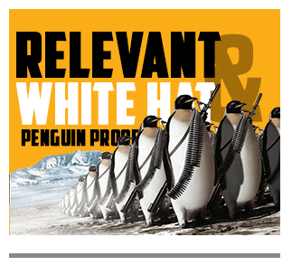
No one has the will power to miss a banner that makes them smile, or better laugh. The challenge is, however, to come up with a banner that will not only be funny, but will also be good-taste and relevant to your offer.
2. Fantasy banner
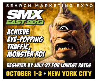
Some banners just look like movie CD boxes or fantasy book covers. As they say, all is fair in love and war advertising. So, as long as it produces impact - it's justified. For example, like this ciclope-themed banner that promotes SMX East 2013. It also utilizes word play as you may notice: "eye-popping" traffic and "monster" ROI.
3. Fill-out form banner
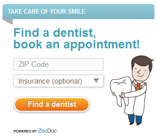
Banners that look like forms that one is supposed to fill out are nothing new. But I somehow always end up paying attention to them. I think the catch behind these is that people are inherently afraid of the unknown. So, they're much more likely to click on a banner that tells you what specific action you should take and what your action will result in.
For example, this ZocDoc banner invites you to enter your ZIP code and look for a dentist in your neighborhood.
4. Real bargain banner
We people are naturally drawn to good deals. When we manage to buy something cheaply, it makes us feel good about ourselves. So, Web users tend to pay attention to offers that have some obvious advantage such as lucrative price.
And, good price is something this WebMeUp tools banner pretty much screams about.

5. Though-stimulating banner
The power of human curiosity is huge. Some even say that curiosity is stronger than fear, love and all some other pretty powerful feelings. Even though that could be a disputable question, banners that make you curious work quite well.
For example, there is just something about this banner by Lumosity. It made me think. It also made me wonder why these human figures are different. Well, they are brain and cognition specialists - I trust they knew what they were doing with this banner. 🙂

6. Rhetorical question banner
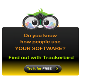
As you perhaps know, rhetorical questions (the ones that don't really require an answer or to which the answer is self-evident) are used to grab one's attention and stimulate cognitive processes. So, questions work great in banners.
7. Famous person banner
OK, for legal reasons, you can't use images of celebrities in your banners. But if you're holding an event, a conference or have high-profile customers, you can leverage that to make your ad banner more noteworthy.
For example, check out how Social Media Today announced their upcoming Social Shake-Up conference in Atlanta:

Never mind the color grey in this banner. This is made to make the banner agree with Social Media Todays brand colors (blue, grey and orange).
8. Colors-of-the-rainbow banner
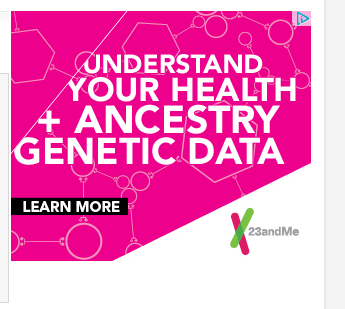
As you may have noticed, many of the successful banners above are yellow or orange with black letters on them. According to Unbeatable Banners, this particular color scheme provides the most contrast within the banner as well as against the average webpages background (which is normally white).
Besides, colorful, contrasting banners tend to grab attention in general. But, again, make sure there is enough contrast. Check out some examples below:

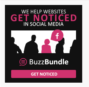
The BuzzBundle banner thats part of the promo materials kit we offer to affiliate marketers:
9. Time-pressure banner
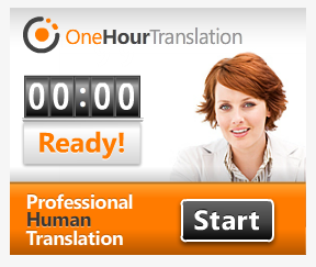
I have also observed that I generally pay attention to banners that have something to do with countdowns, sand clocks and timing in general.
This banner by OneHourTranslation got my attention. By the way, the first time I paid attention to it, the time had already elapsed and the clock had all zeros in it, but I liked the idea regardless. Do you?

10. Faulty grammar banner
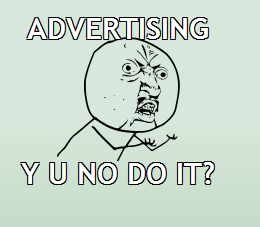
In my opinion, faulty grammar banners are just that - memorable. Remember the famous I'm loving it McDonalds slogan?
Now, it looks like DigitalPoint Forums are also being creative with their banner, in which they're speaking anything but proper English.
Conclusion
Well, you've just seen for yourselves - the ad banners that somehow managed to grab my attention and to stand out of the crowd for me. Ive also tried to demystify the magic behind them as much as could, but perhaps some of you may do it better.
By the way, if you have seen a nice ad banner on the Nets lately, do share the inspiration in comments. And, if you need help finding it, you could use Moat, a search engine that lets you search for banners by brand names. This is the one I used to locate some of the banners in this article.
Happy banner making!
