You already know that a big fat list is one of the best ways to monetize your site's traffic. But as you've probably seen firsthand, simply tossing up an email opt-in form doesn't work very well. If you want to get more subscribers from your existing traffic, check out these 5 proven tweaks.
#1: Pimp Out Your Sign-Up Form With Benefits
How many times have you seen a lame opt-in form like this:

What sane person would ever hand over their name and email to that form? On the other hand, check out this tricked-out form, with a list of crystal-clear benefits:

This is the kind of thing that gets subscribers! Why? Because it gives them multiple reasons to join at a critical decision making time. Even if you list the benefits of signing up elsewhere on your site, it's crucial that you reiterate them right before the person signs up.
#2: Delete The Words "Submit" and "Register" From Your Vocabulary
This is another opt-in form tweak that can make a massive difference in your conversion rate. According to QuickSprout.com, changing the wording of the submit button can make a world of difference. They report that replacing commitment words like "Download", "Register" and "Submit" with less threatening terms like "Click Here", "Free Instant Access" and "Get Free Updates" significantly increases subscriptions. Here's an example:

#3: Rethink Your Homepage
Your homepage is a great way to show new visitors your newest and best content, right? Wrong. Your homepage is first and foremost an opt-in powerhouse. And you can get subscribers using your homepage without looking spammy. Just take a look at ThinkTraffic.net's homepage:

Instead of a generic homepage with his latest posts, Corbett has decided to place a large -- but sharp looking -- opt-in form above the fold. Consider tweaking your homepage so that give visitors a chance to sign up when visiting your site for the first time.
#4: Add The Form to More Places
Having a form in the sidebar is step #1. If you're serious about conversions you need to have your form twice on every page (if not more). This rule even applies to pages like your About page. I'd be willing to bet that your about page probably gets a ton of traffic, but not many conversions. But you can change that with a small opt-in form plopped in the middle of the page. That's what I've done at Backlinko, and it's boosted conversions quite a bit:

Just keep in mind that it's very easy to go too far with this technique. You don't want to overload your visitor with opt-in forms. But you do want to give them multiple opportunities to sign up. Consider it list building Zen: you need to find the middle path between spammy and obvious.
#5: Show Off With Social Proof
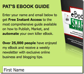
There's a split second in your visitor's brain that makes them hesitate before handing over their email: "Do I even need this free report?" "What if they spam me?" "I'm not sure I want to give them my real name and email...I'll use a fake one" Most of these fears can be erased with a little bit of social proof. Nothing makes people think "this is a great idea!" more than social proof. Here's an example of this from Smart Passive Income:

Imagine what a hesitant visitor thinks when they see that 25,000 people have already signed up. Even if you've just launched your free report or newsletter, consider tossing in any social proof numbers that you can. Facebook likes and Twitter followers can work just as well.


Nice article Brian! I especially agree with your first point, a bland, name and email box gives people no reason at all to sign up. it’s critical that you include a short, concise list of benefits! “exclusive special offers” is always a good one for ecommerce websites.
Thanks Shell. I’m not sure if people with bland forms would sign up for their own stuff! People are more reluctant than over to hand over their name and email. You definitely have to make them want your offer bad enough to fork over their name and email.
Do you really think that using “click here” instead of “register” might be a good choice? Honestly, click here looks more spammy to me